THE BODY LAB
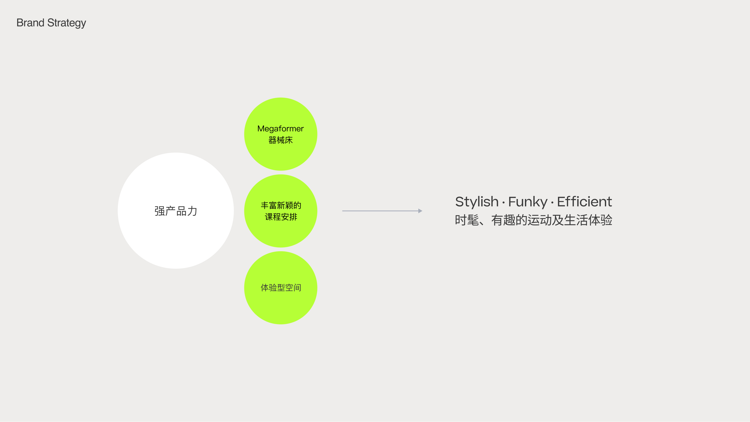
The Body Lab is the first gym in China to introduce the top-tier training equipment, the Megaformer. This machine focuses on strength and flexibility exercises powered by resistance, offering an efficient fat-burning and body-toning workout on a spring-loaded platform. With its refreshing training experience, it has revolutionized the fitness industry by providing urbanites with a stylish and effective fitness solution.
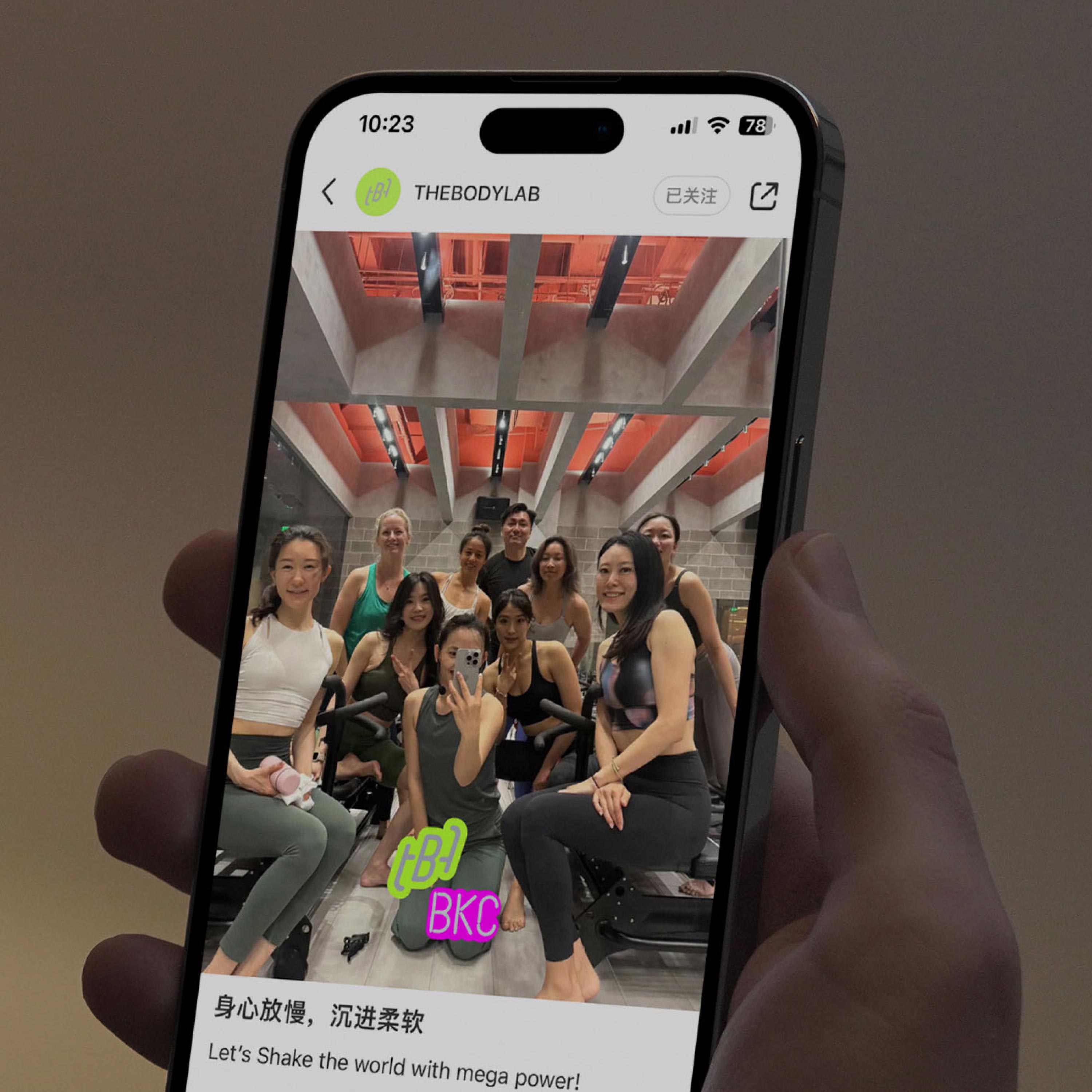
As the brand continues to expand, TBL needs to update its comprehensive and flexible brand visual language to support its chain operations, showcase its community culture, and enhance the promotion and visibility of the TBL fitness lifestyle.
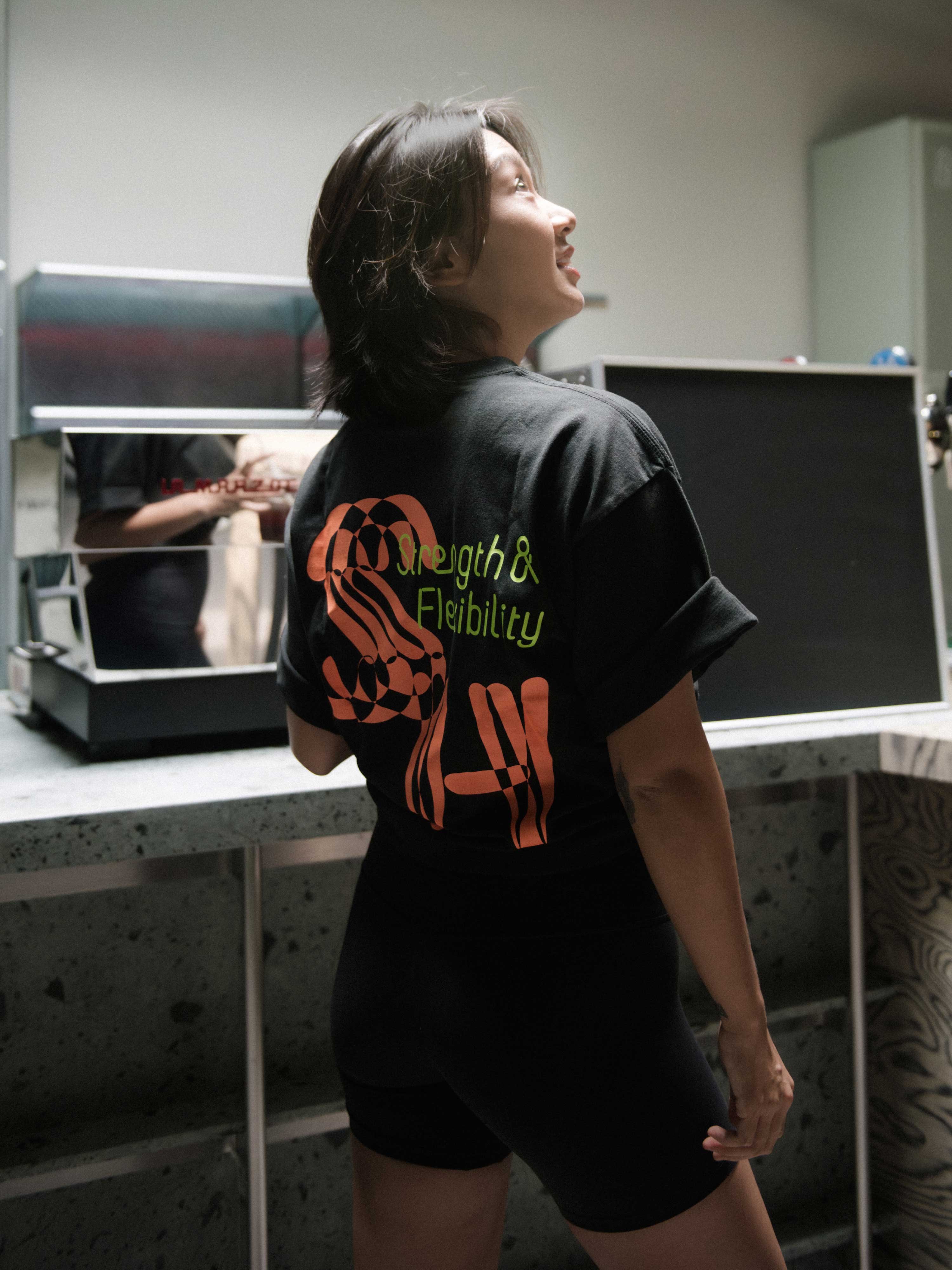
Based on the uniqueness of its training methods and class formats, we developed a dynamic VI system, auxiliary graphics, and extended application materials. We also refined the usage and recognition of the original logo. Together with TBL, we created a brand that reflects a more stylish, fun, and efficient approach to fitness and a healthy lifestyle.

Slanted, modular font
The original logo already has a relatively high level of recognition. We adjusted the curves to make it more stable. The three characters of TBL are derived from the unique curved handles of the equipment. Using the logo components as basic elements, we created a distinctive font and graphic, which perfectly aligns with the core of Megaformer training—achieving a variety of training content and forms through the combination of basic modules.


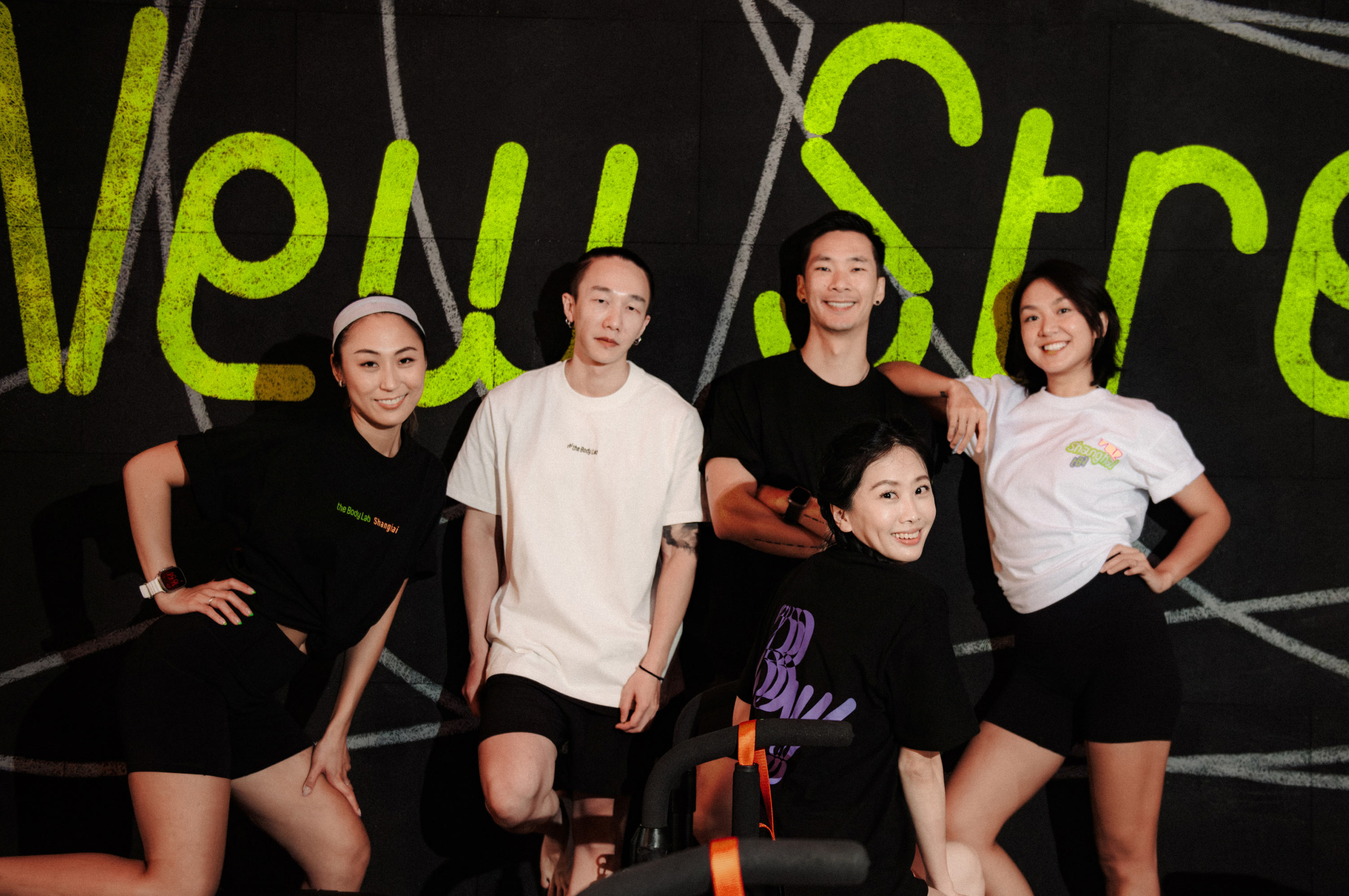


Training on the Megaformer relies on bodyweight and springs, with auxiliary graphics composed of varying line thicknesses and shapes that embody both elasticity and dynamism. These elements can be flexibly extended to create a diverse, yet unified visual identity.


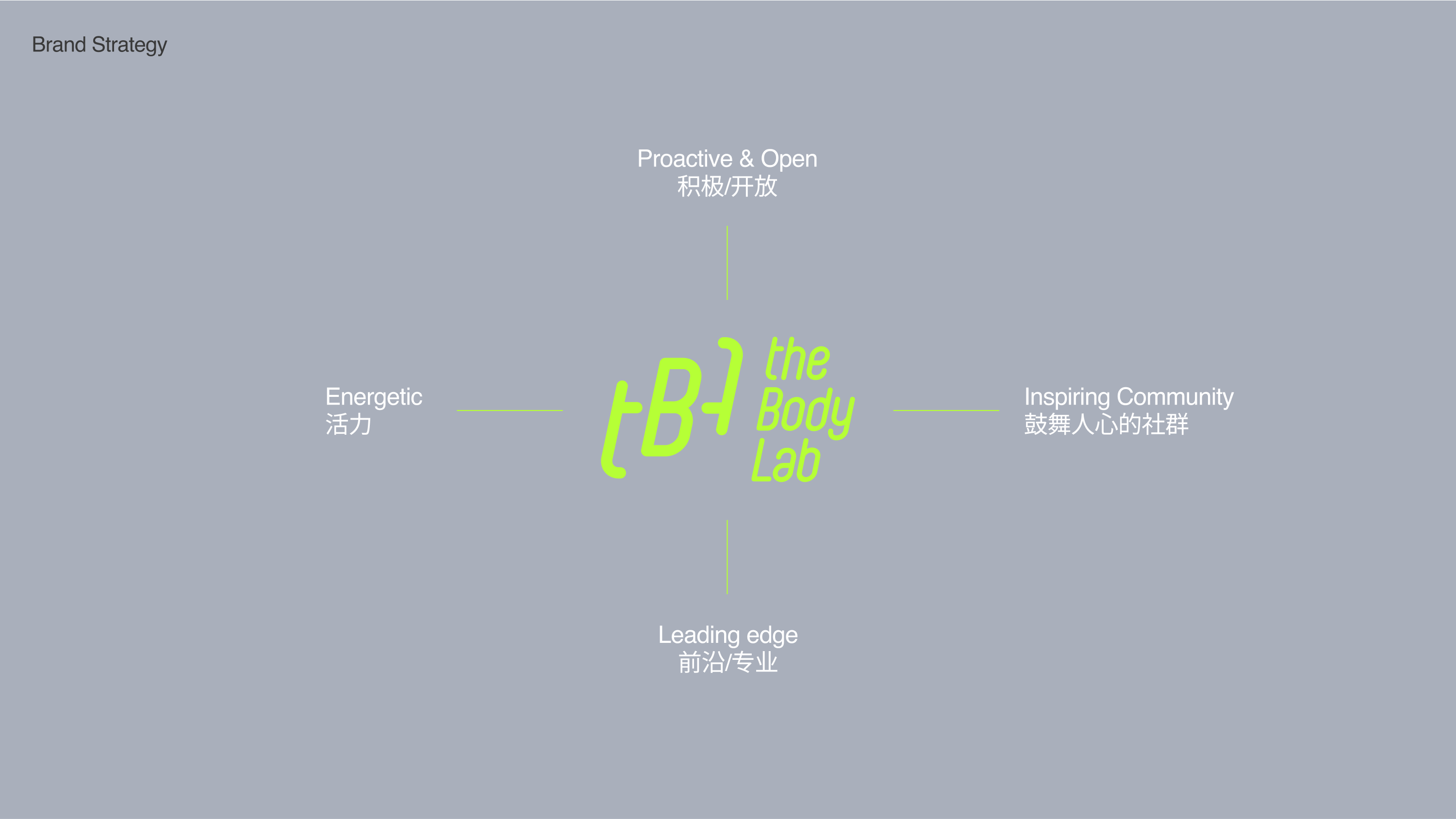
TBL aims to inspire everyone to push their limits, unlock their potential, and enjoy life through sports, while also building connections with others. We create a sense of community with a relaxed and vibrant approach.
