LUCKOLOGY
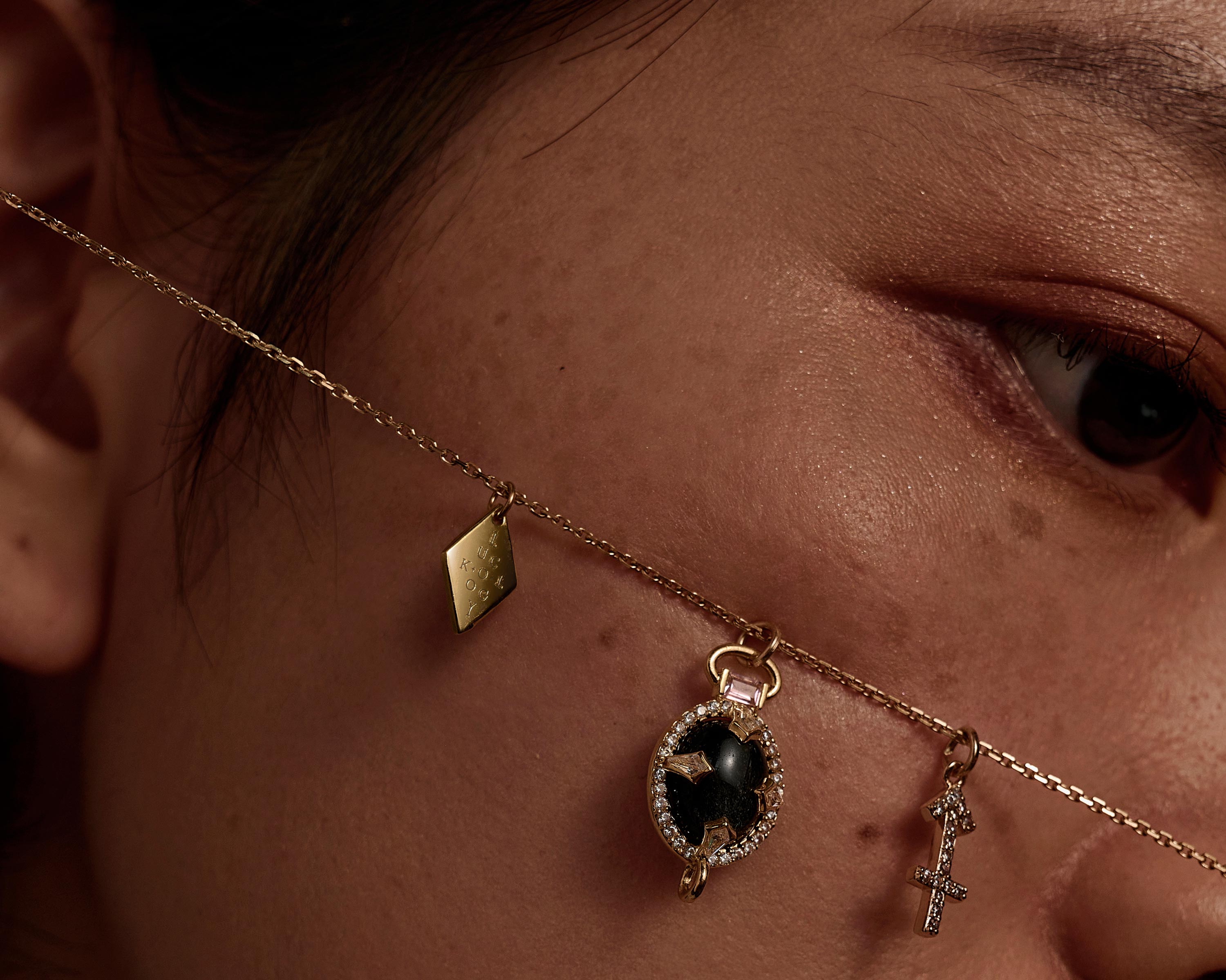
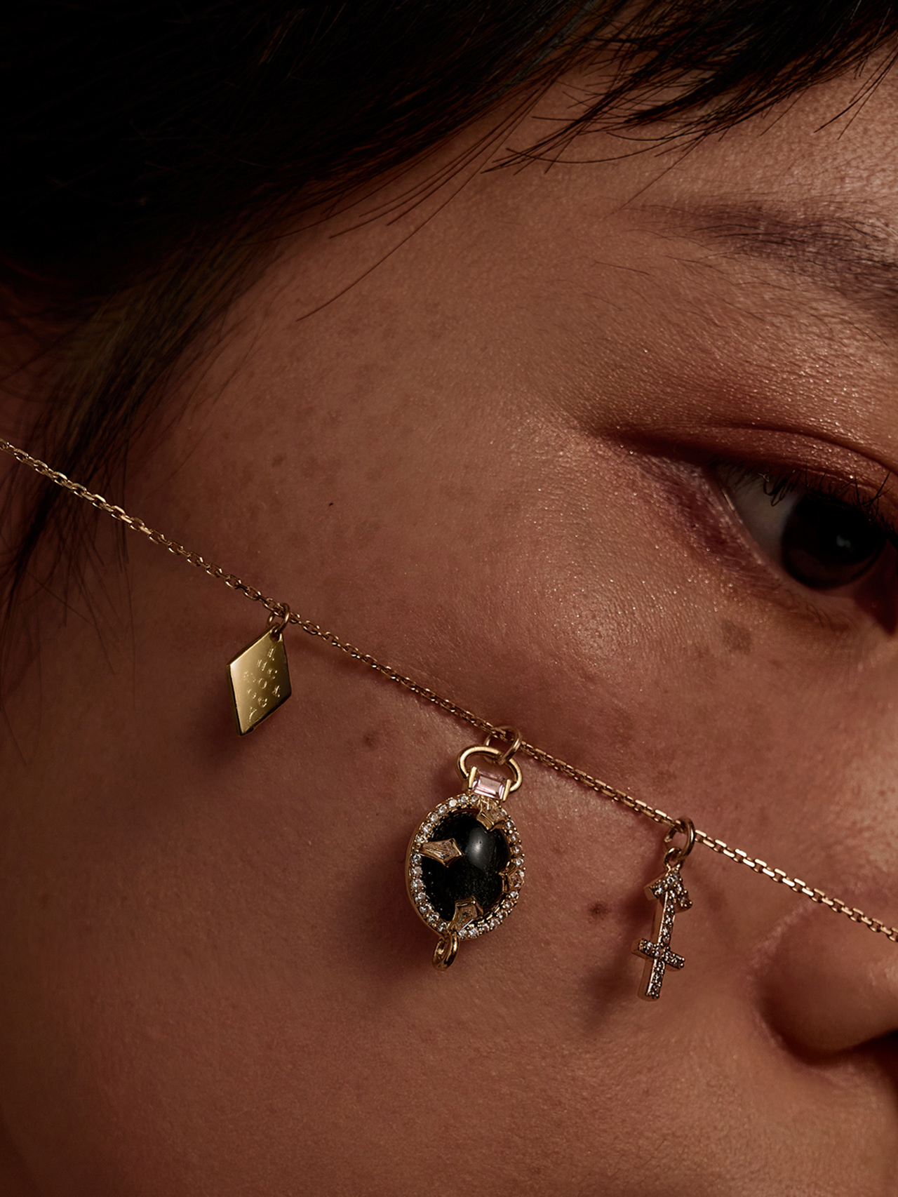
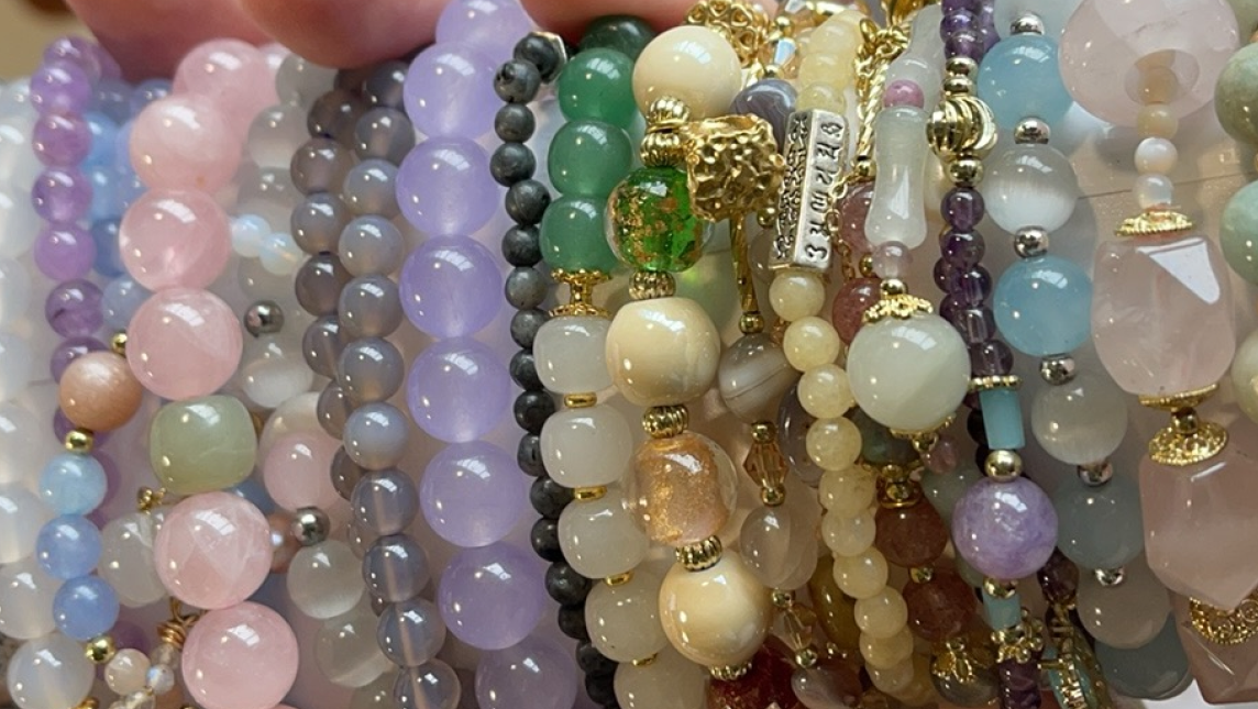
LUCKOLOGY is a lifestyle brand designed to provide luck and support to consumers from the 90s and Generation Z. The brand primarily targets overseas markets, offering products such as crystal jewelry, raw crystal stones, and spiritual lifestyle items. Currently, the market lacks similar brands that emphasize design. As the concept of “spirituality” becomes more mainstream, Luckology aims to offer consumers customized spiritual jewelry with a strong design aesthetic and better cost performance.
STRATEGY
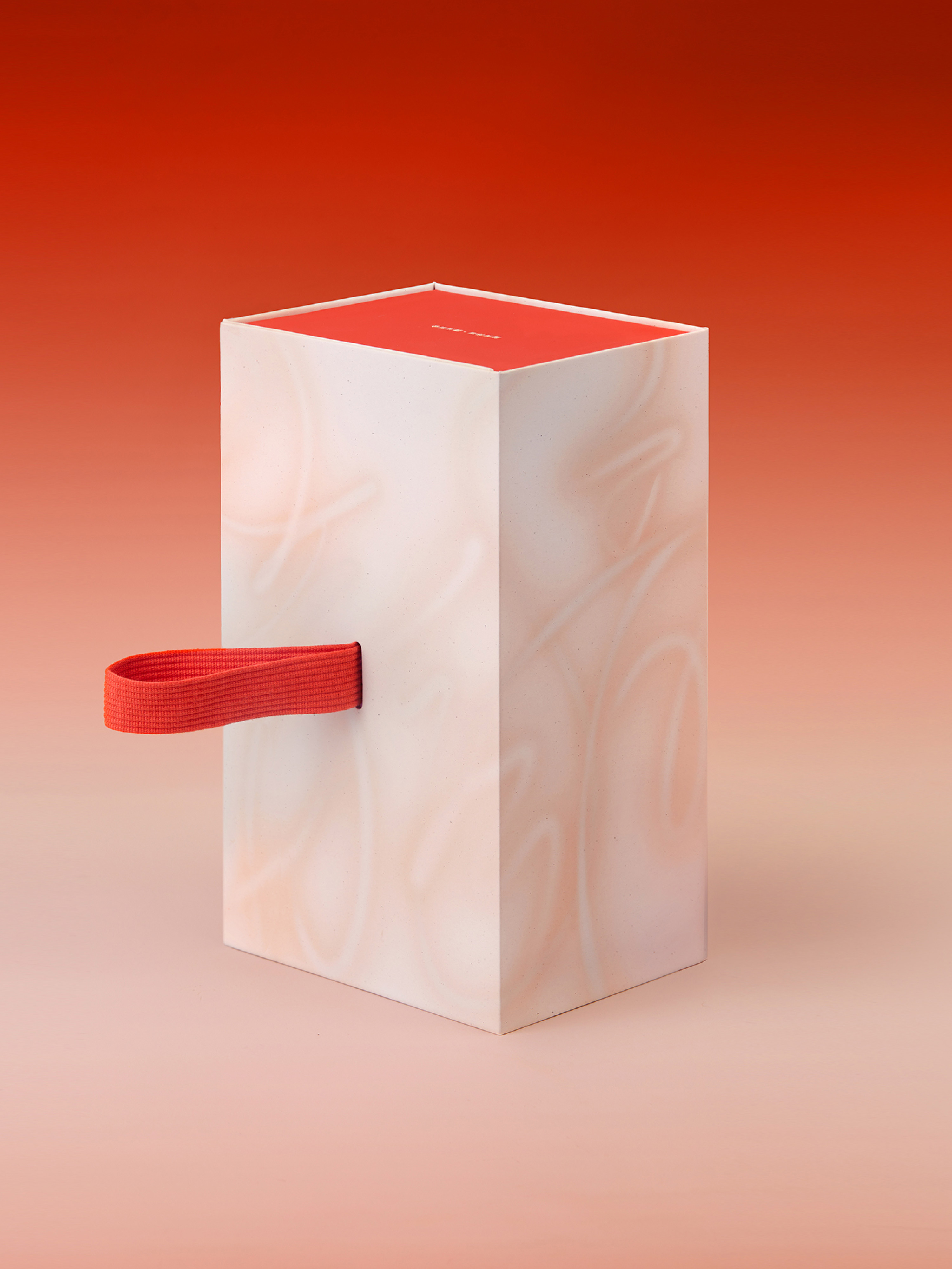
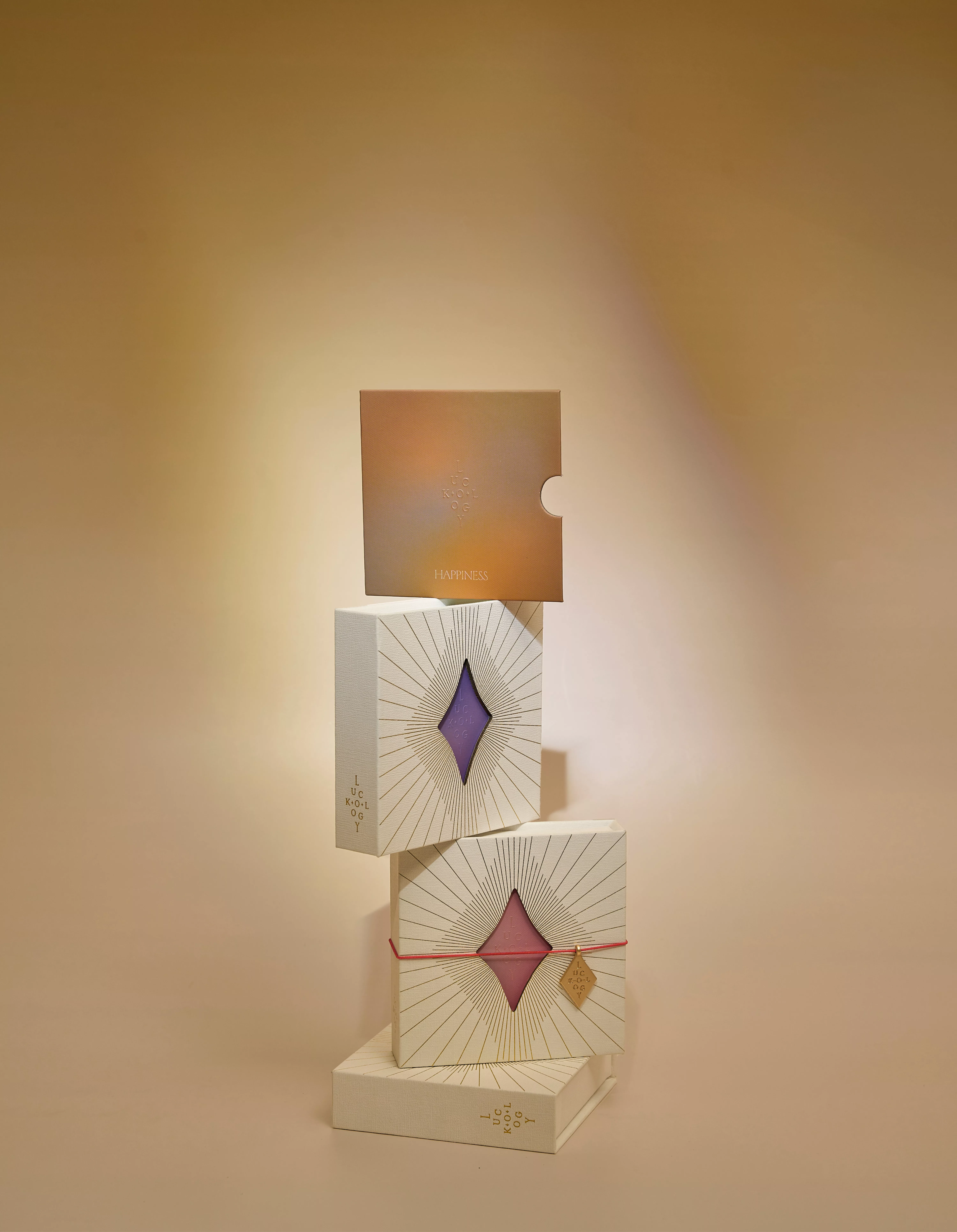
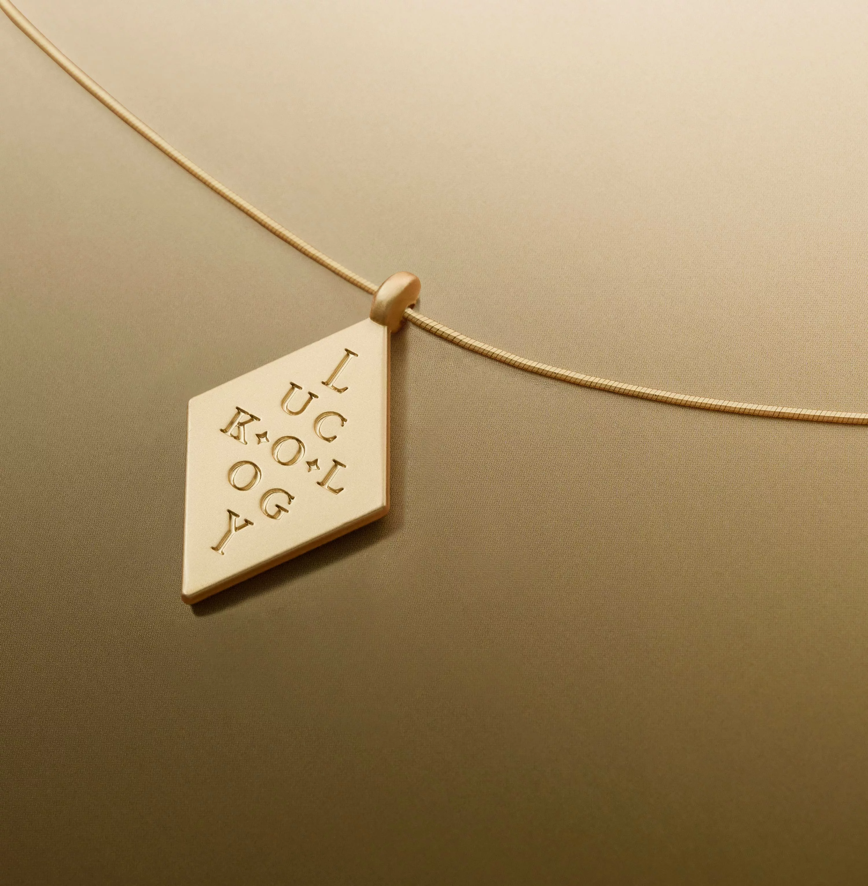
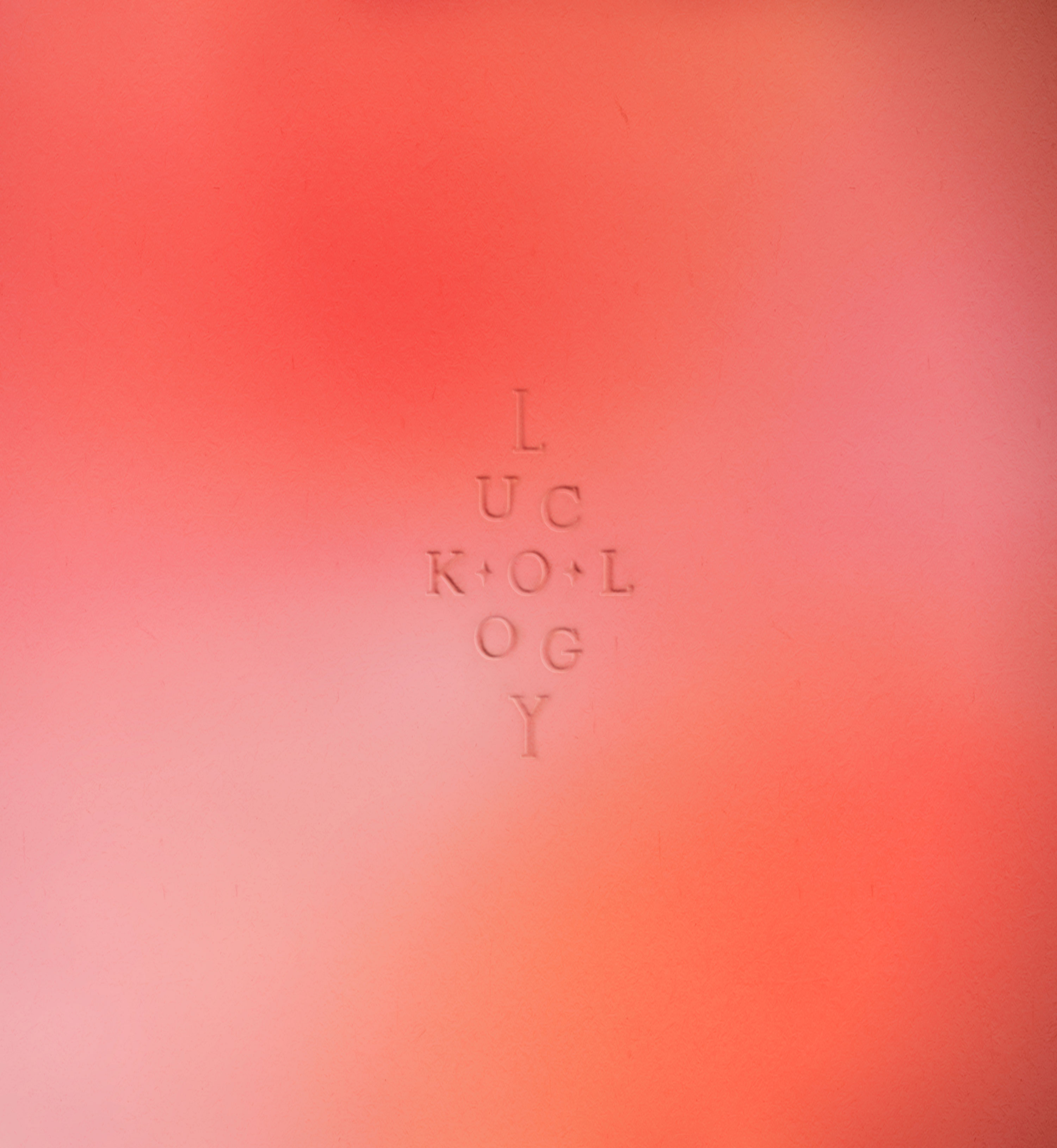
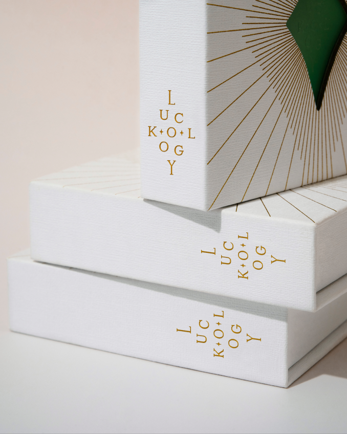
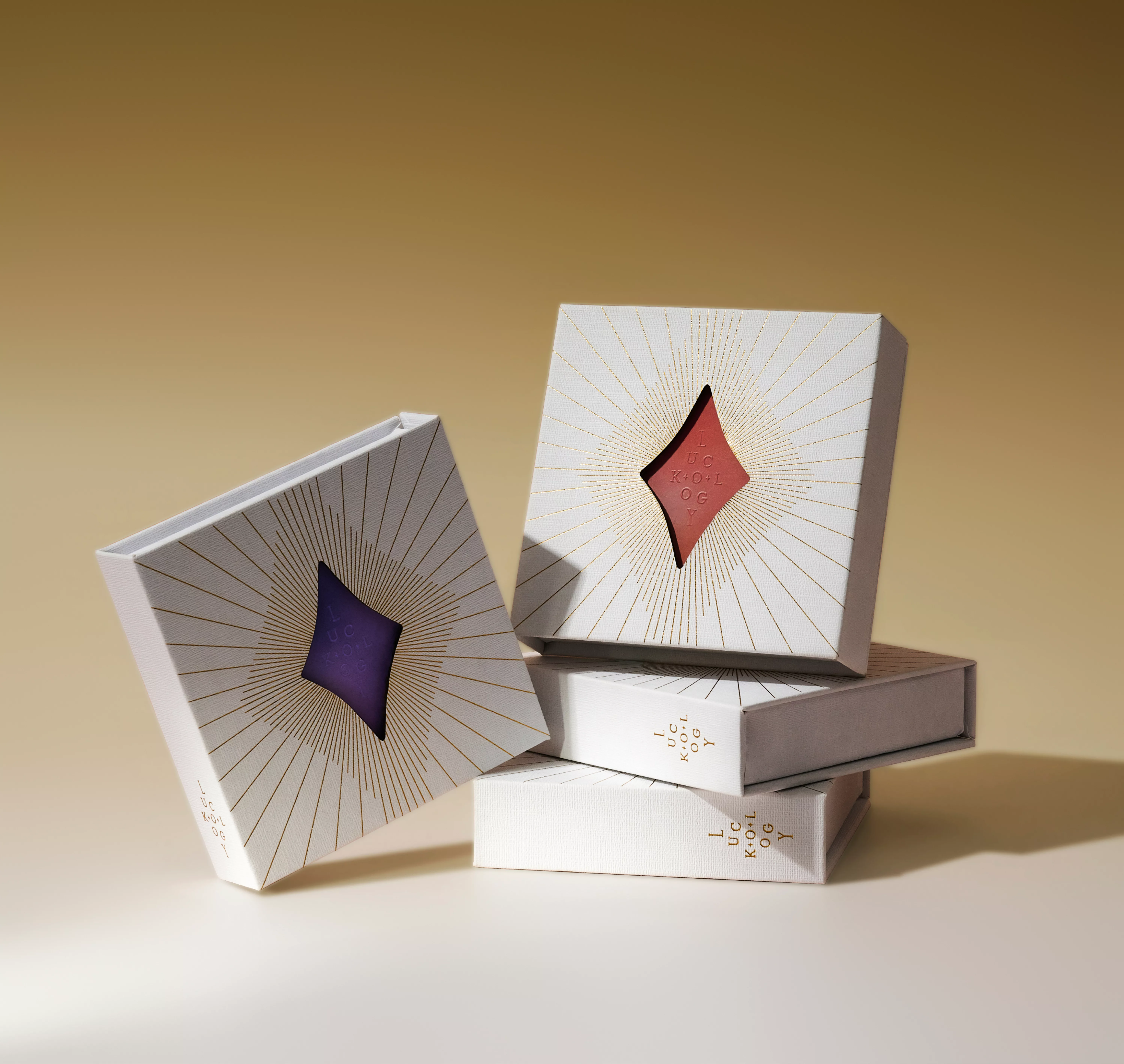
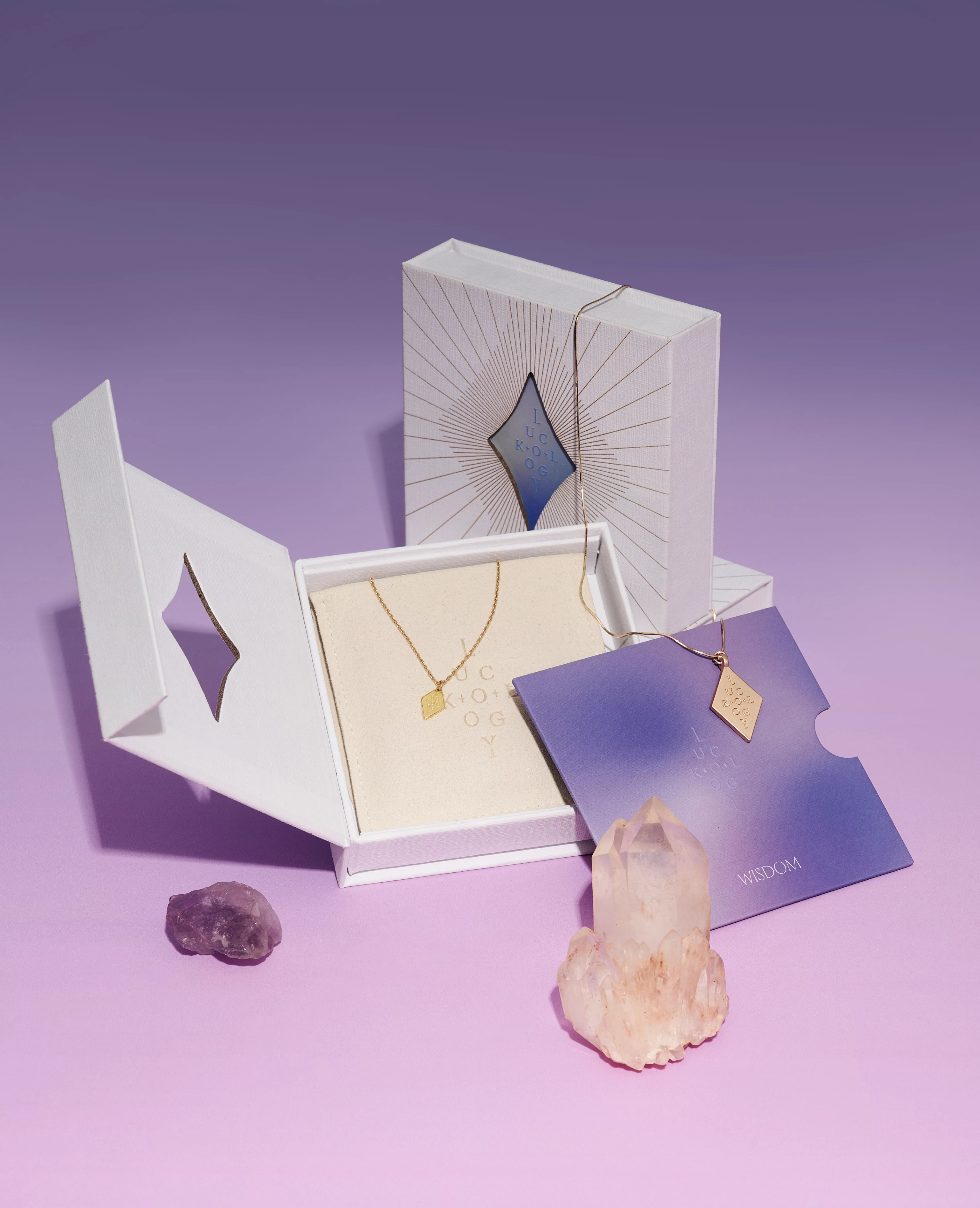
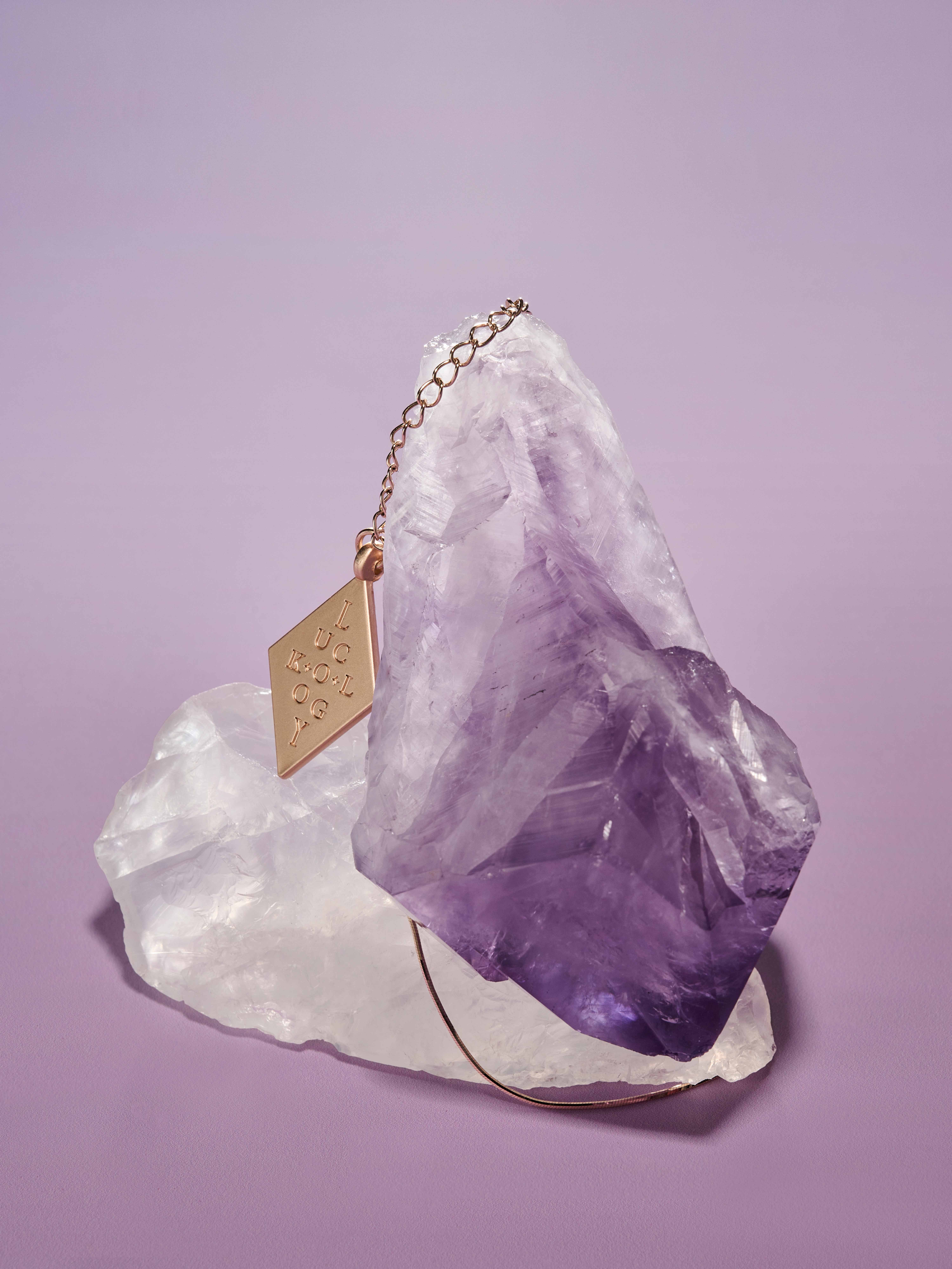
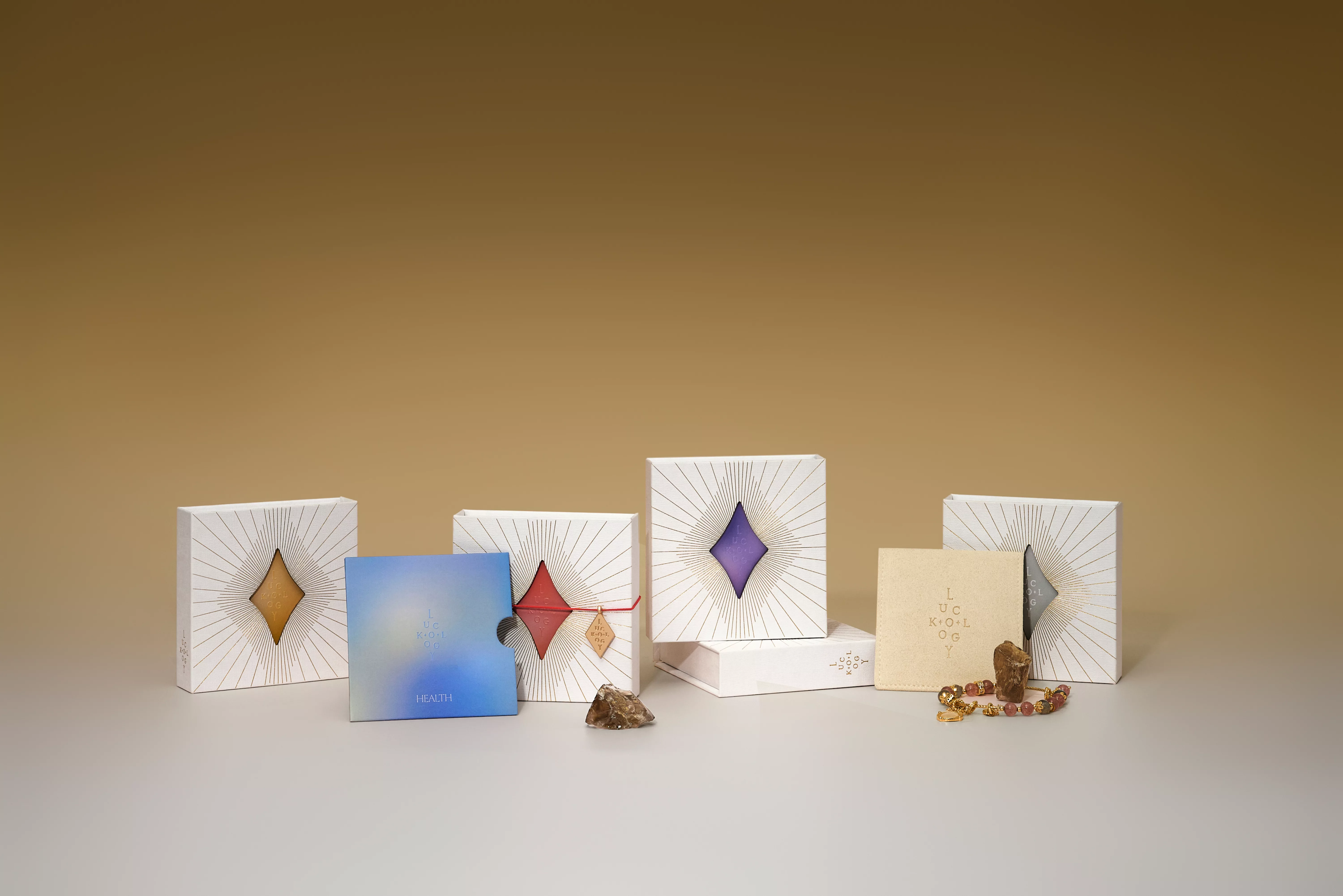
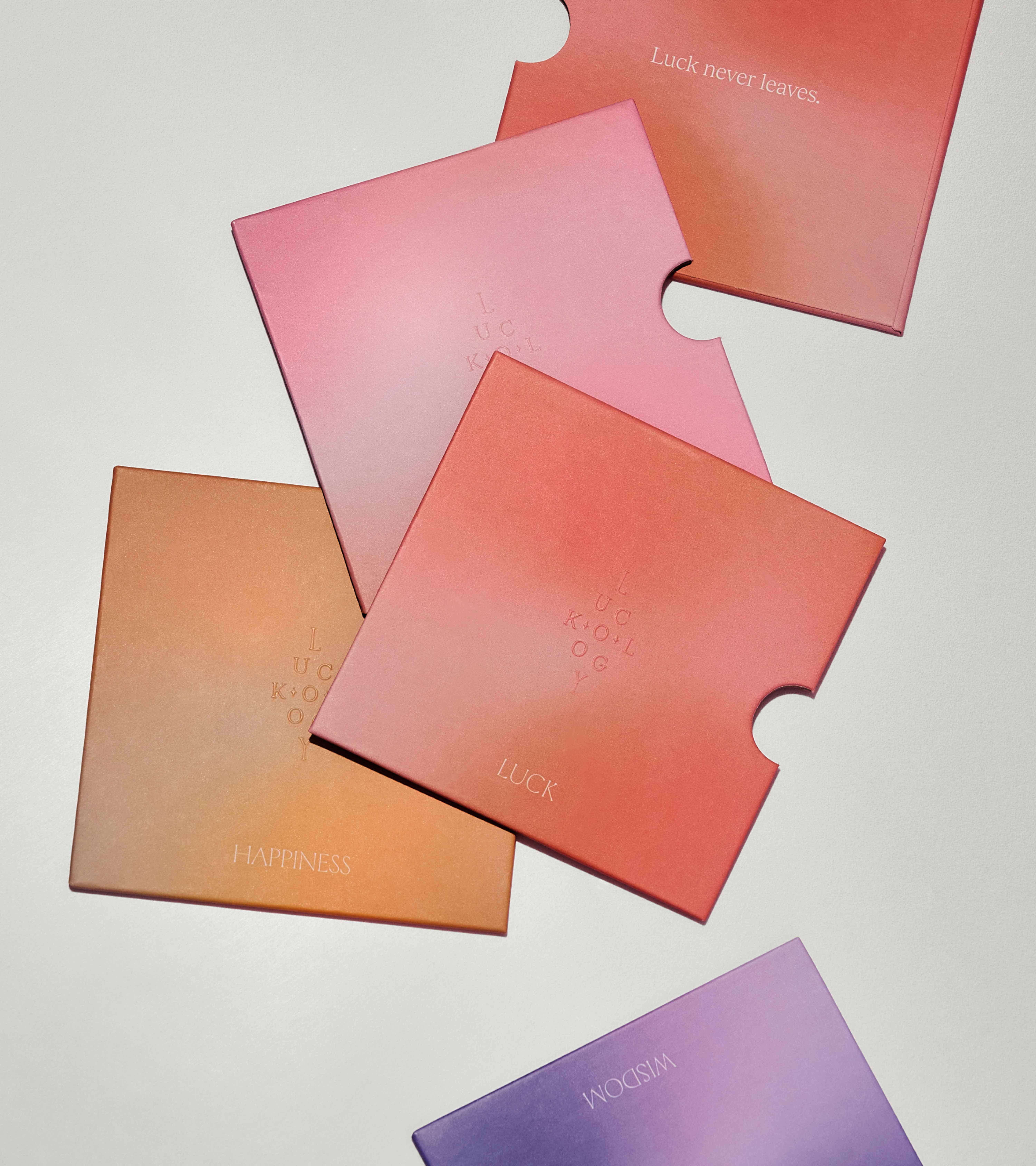
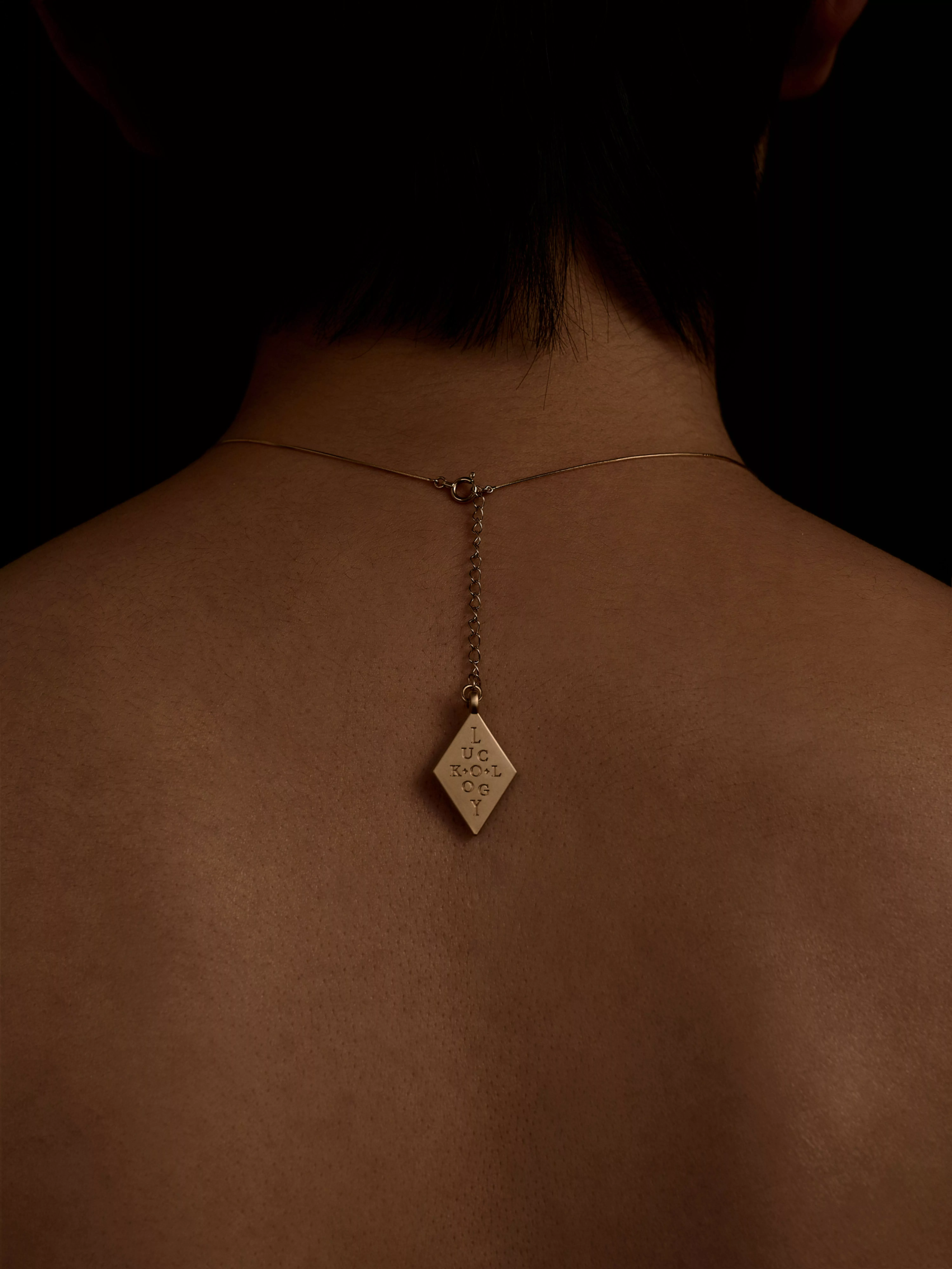
LUCKOLOGY’s spiritual expression is characterized by a refined sense of mystery and a flow of energy. Each piece of jewelry features a unique spiritual stone that represents the energy of a chakra. Building on this foundation, we infused a youthful and vibrant tone and created a brand symbol with spiritual recognition. To achieve this, we arranged and combined letters to form a subtle star symbol as the brand’s logo. The outer contour, which is a star shape, used as an auxiliary graphic. The overall color scheme is rich and vibrant. We chose the colors of the chakras, using single-color and dual-color combinations, and applied dynamic gradients to create a series of flowing, gradient color systems. These are used in packaging and web design.

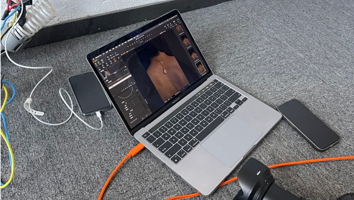
Shooting Day
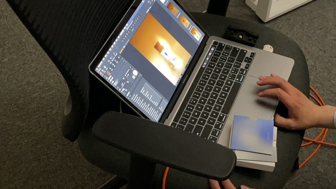
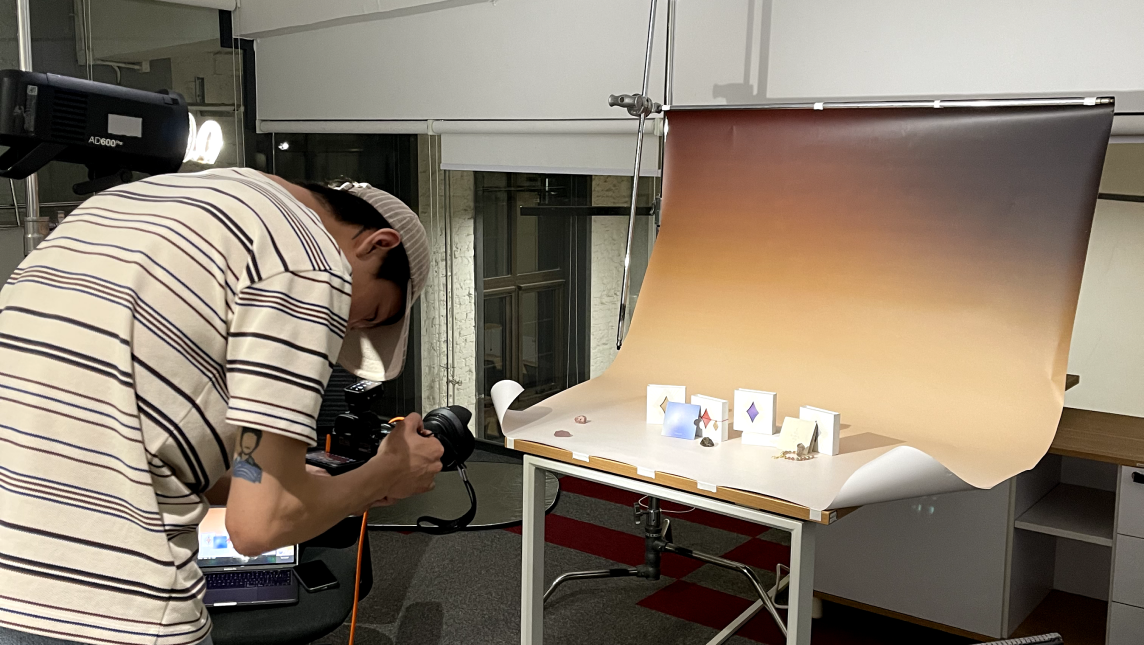
Shooting Day
Shooting Day
Products
Other option
