TITIFUL 提提福
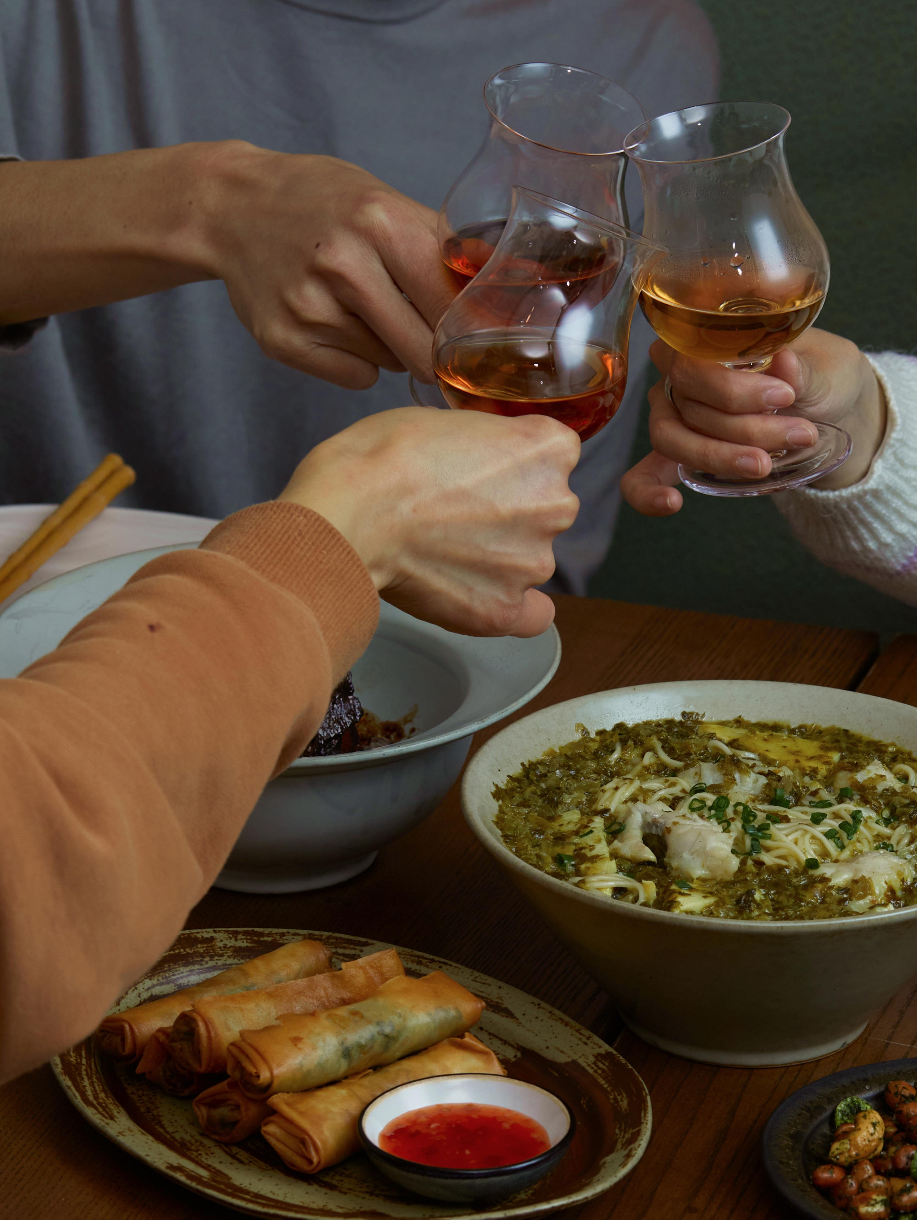
Titifu Jiangsu and Zhejiang Restaurant in Beijing is a local eatery specializing in Jiangsu and Zhejiang cuisine, focusing on yellow wine from these regions, Chinese natural wine, and seasonal dishes. The restaurant aims to provide a warm and joyful neighborhood dining experience rich in local culture.
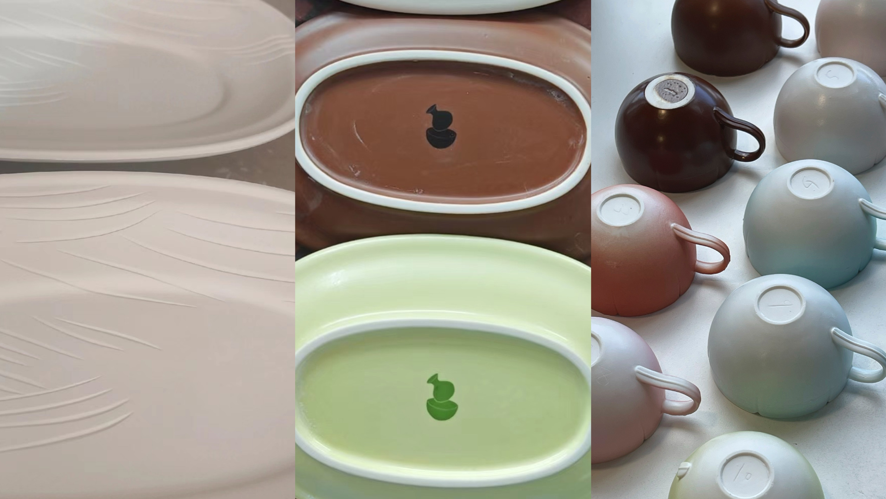
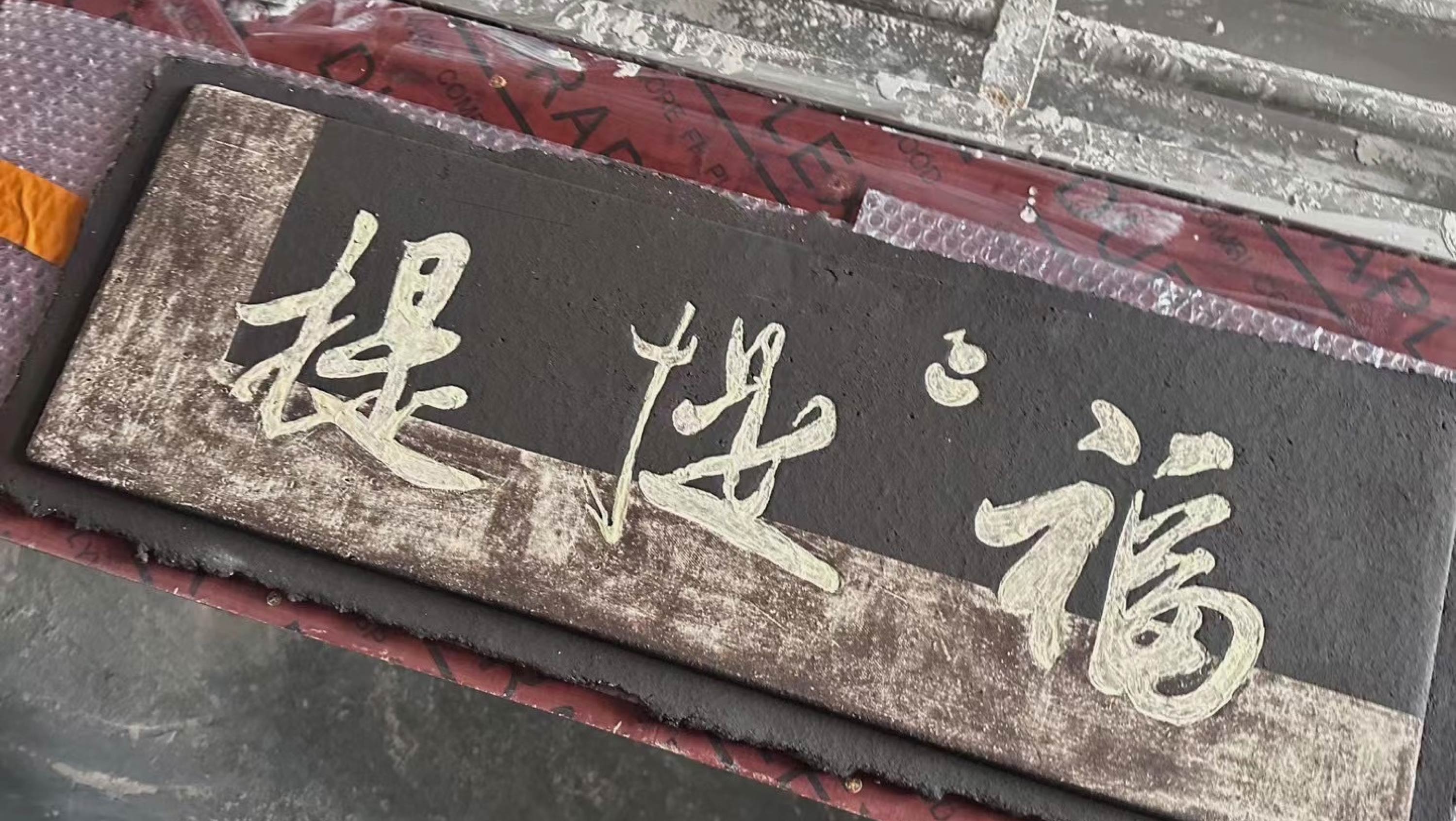
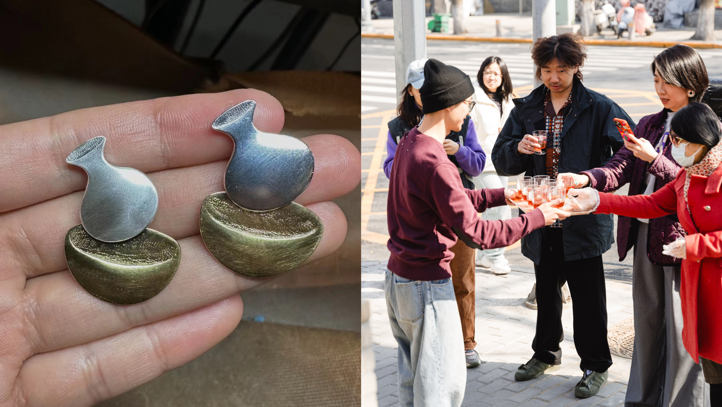
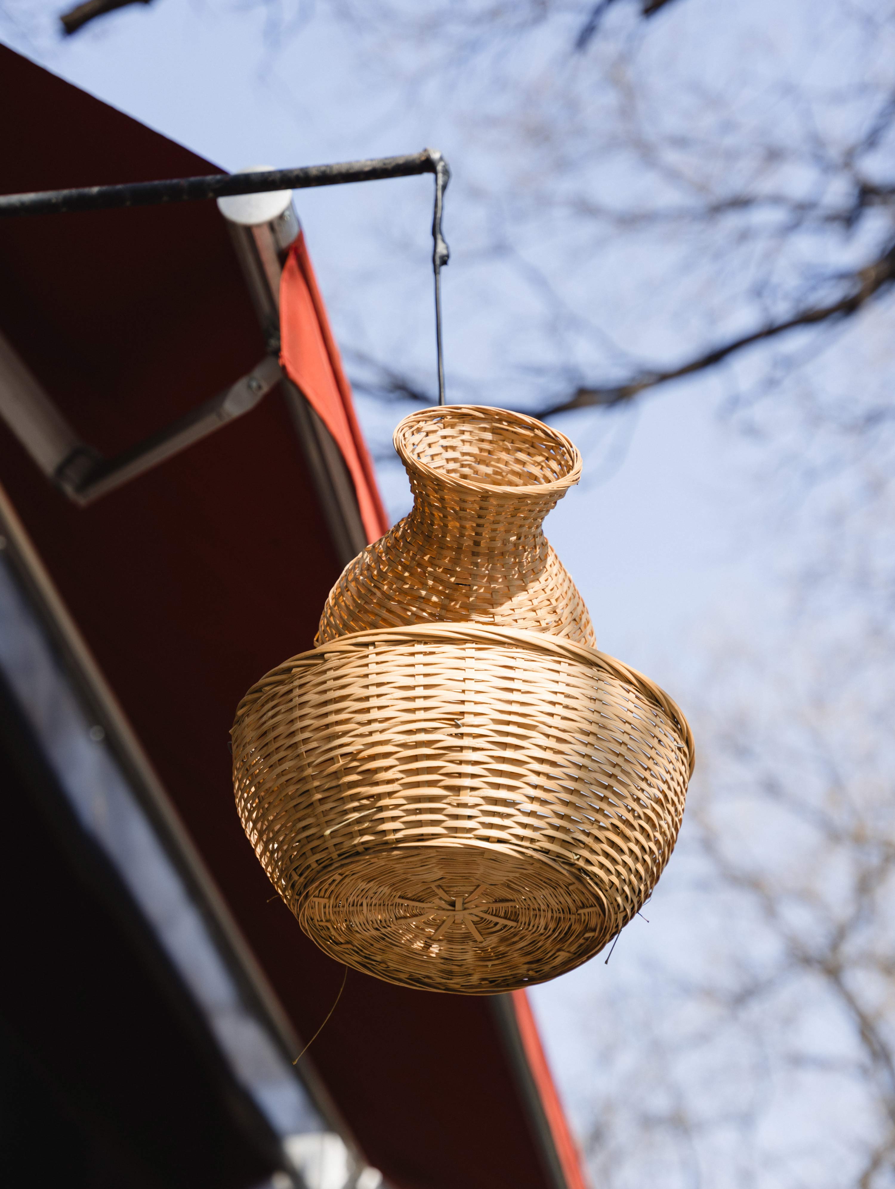
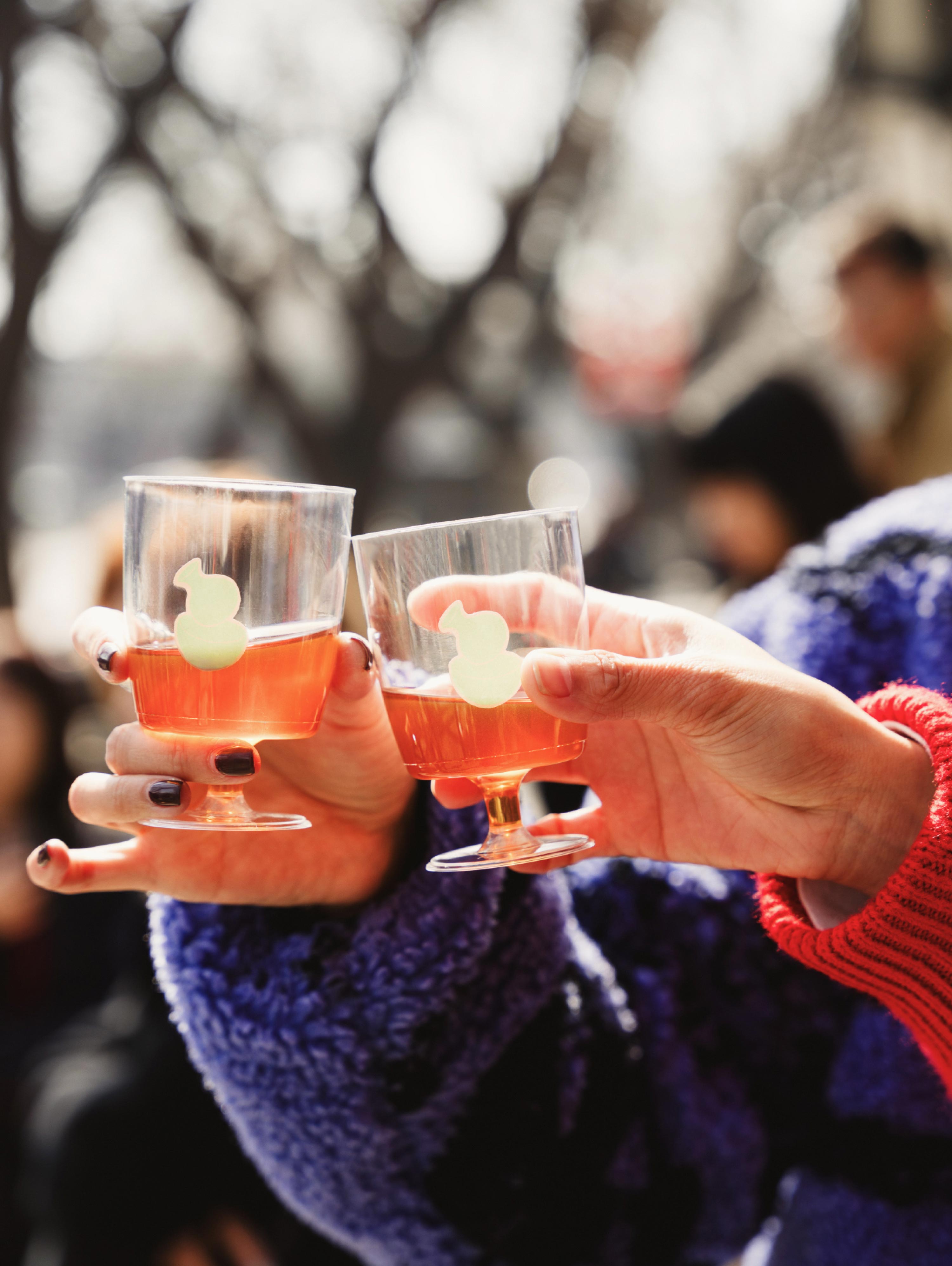
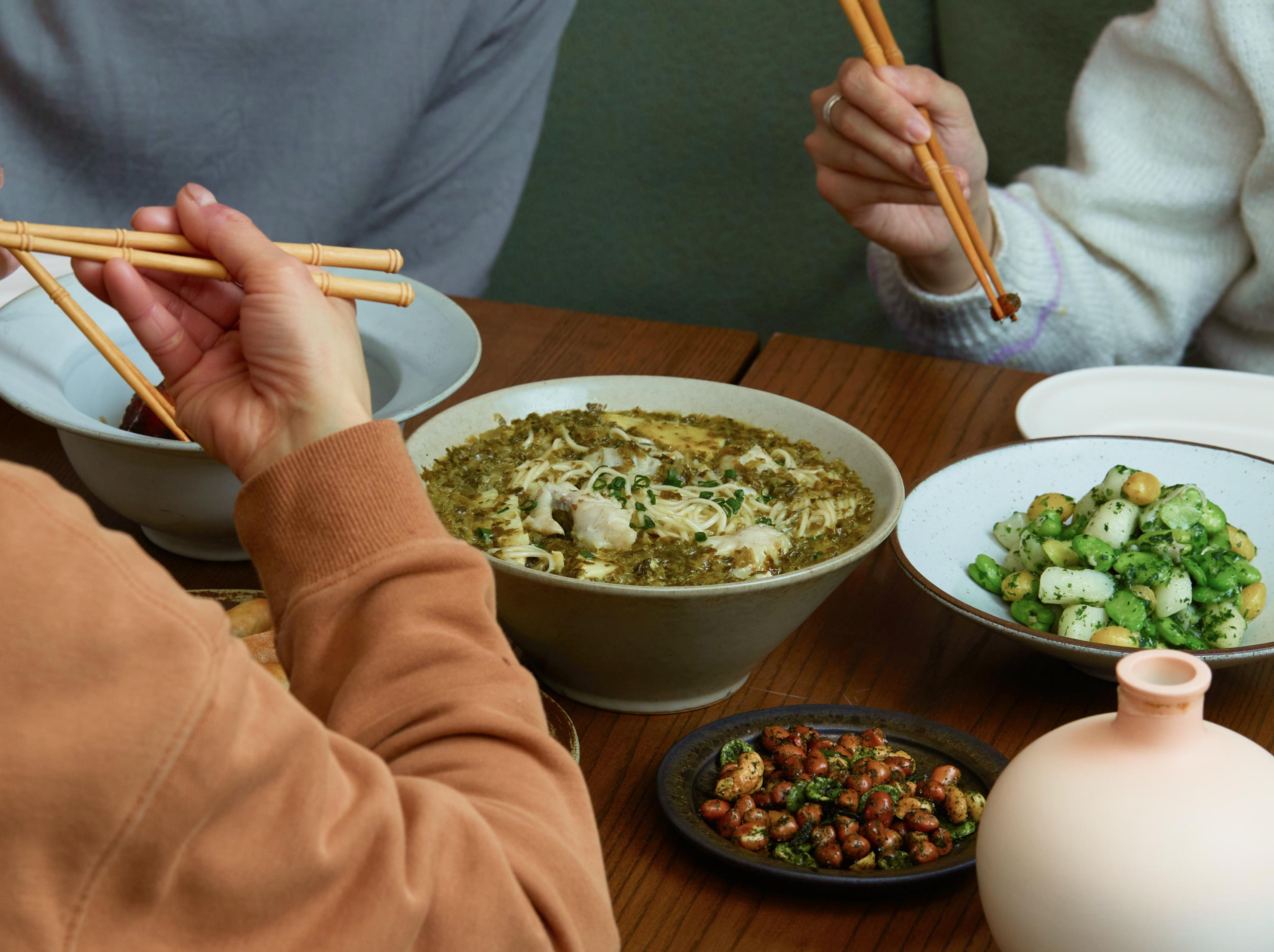
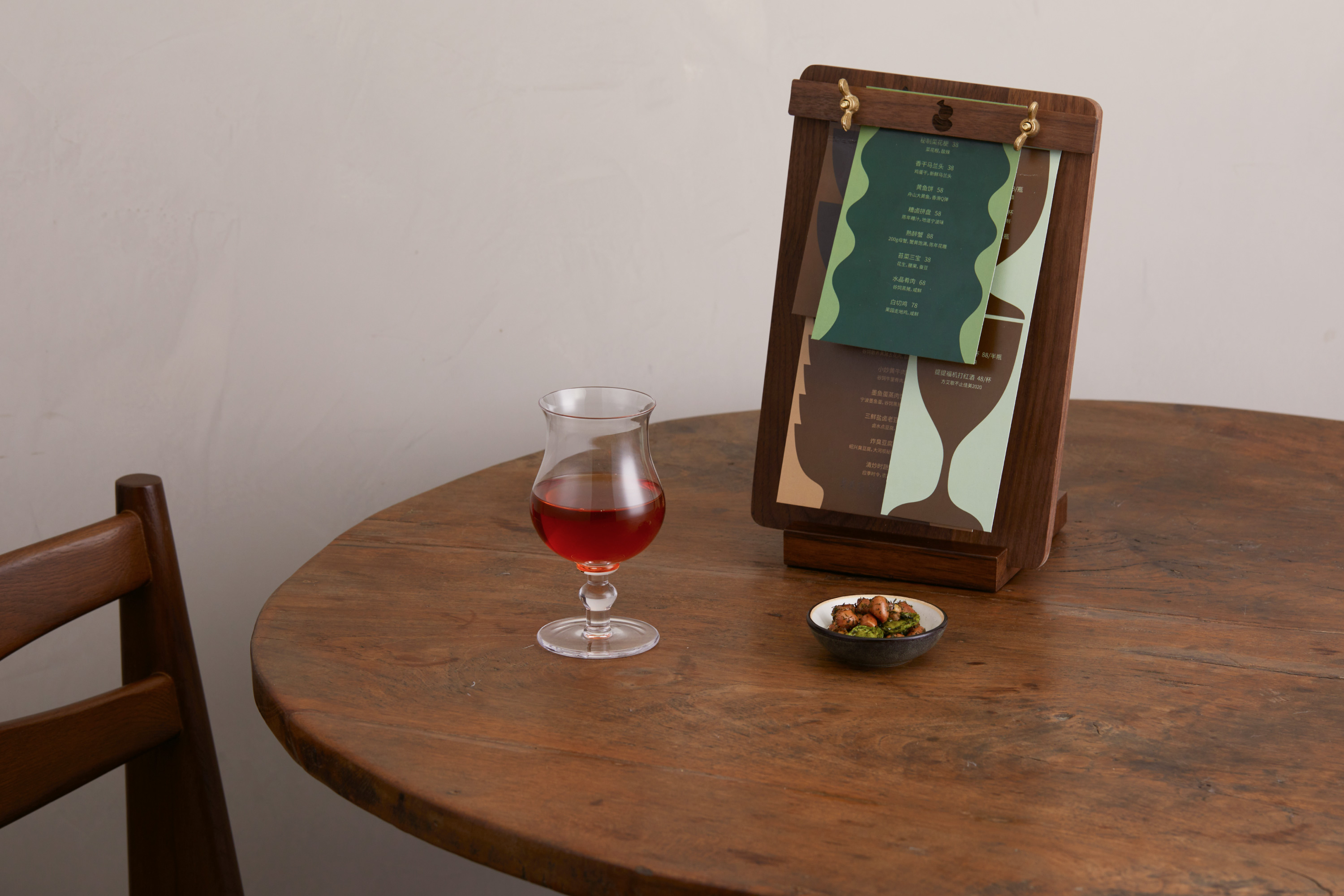
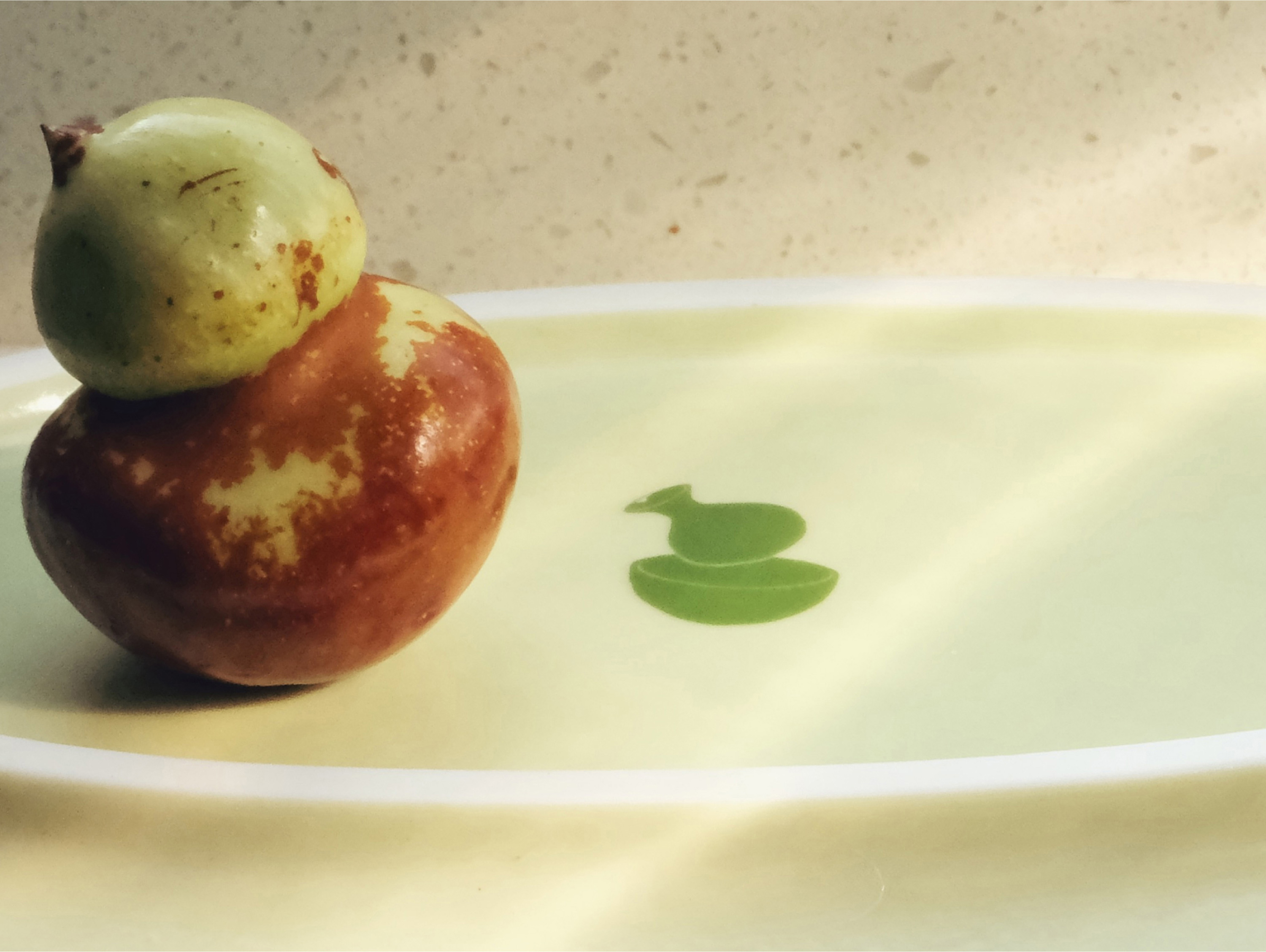
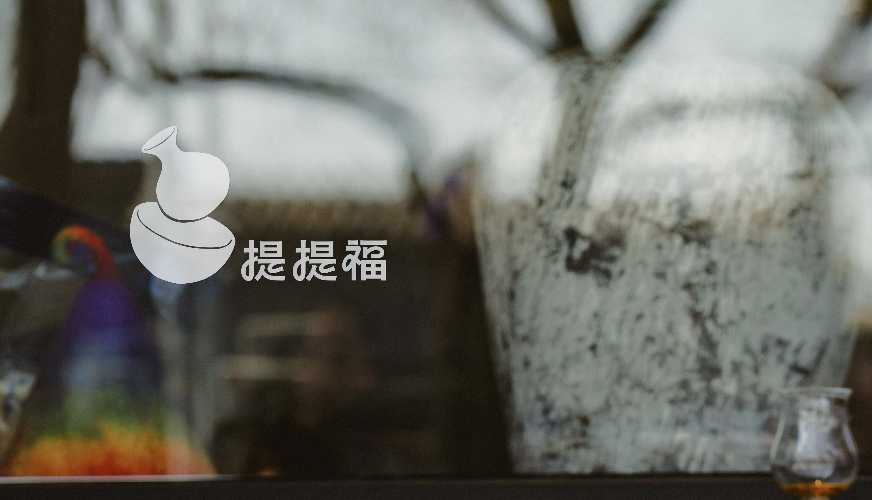
We led the design of the brand’s logo, color palette, auxiliary graphics, and tableware shapes. The character “Fu” (福) is a homophone for “gourd” (葫芦), which served as the primary design element. The logo features a small yellow wine pot and a rice bowl, retaining a hand-drawn style to emphasize craftsmanship. The wordmark simplifies strokes, ensuring readability while conveying a relaxed and playful image. The goal is to represent a restaurant that reflects local culture and exudes a casual, welcoming atmosphere.
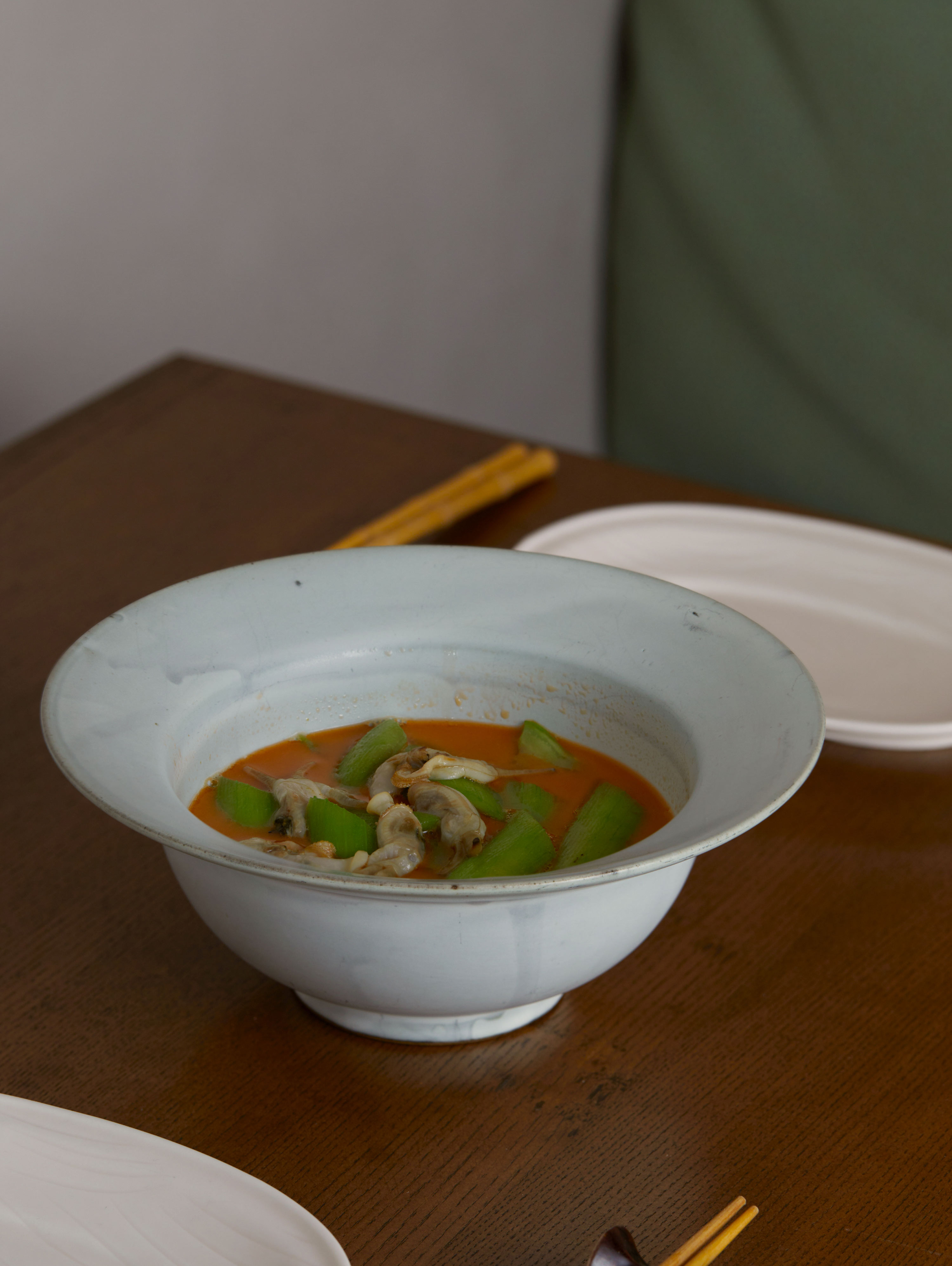
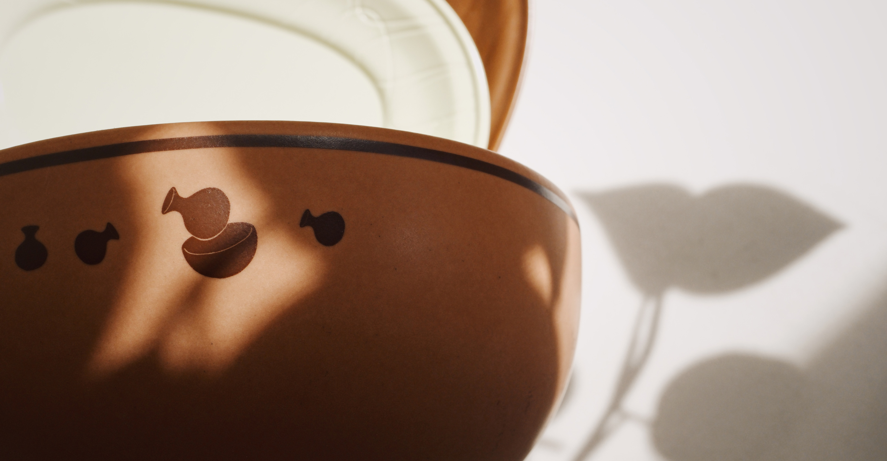
The auxiliary graphics were inspired by the dishes and wines, drawing visual elements to create patterns used on different plates and bowls, complementing various dishes.
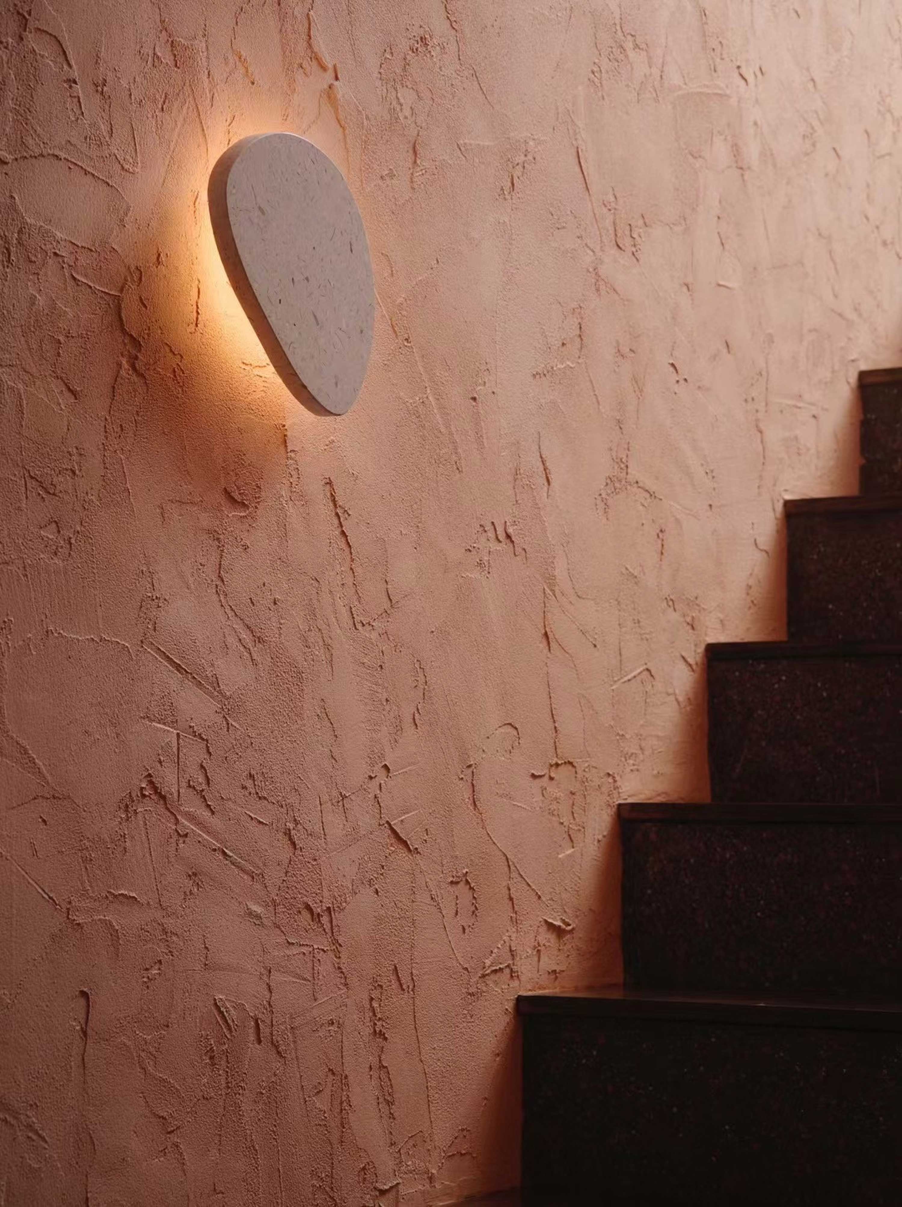
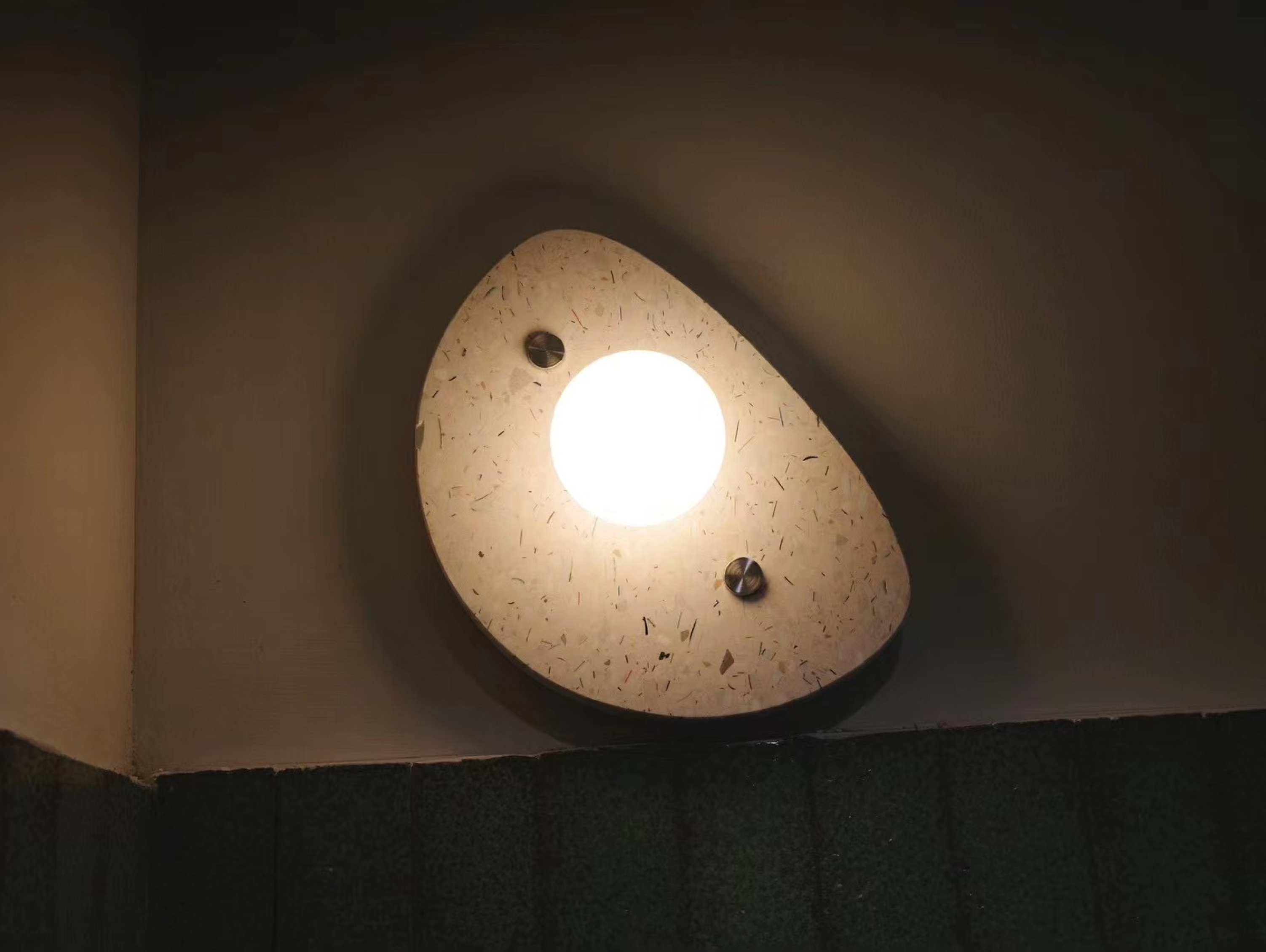
The overall space continues the brand’s color scheme, using deep warm tones to create a cozy atmosphere that resonates with the colors of the food and drinks.
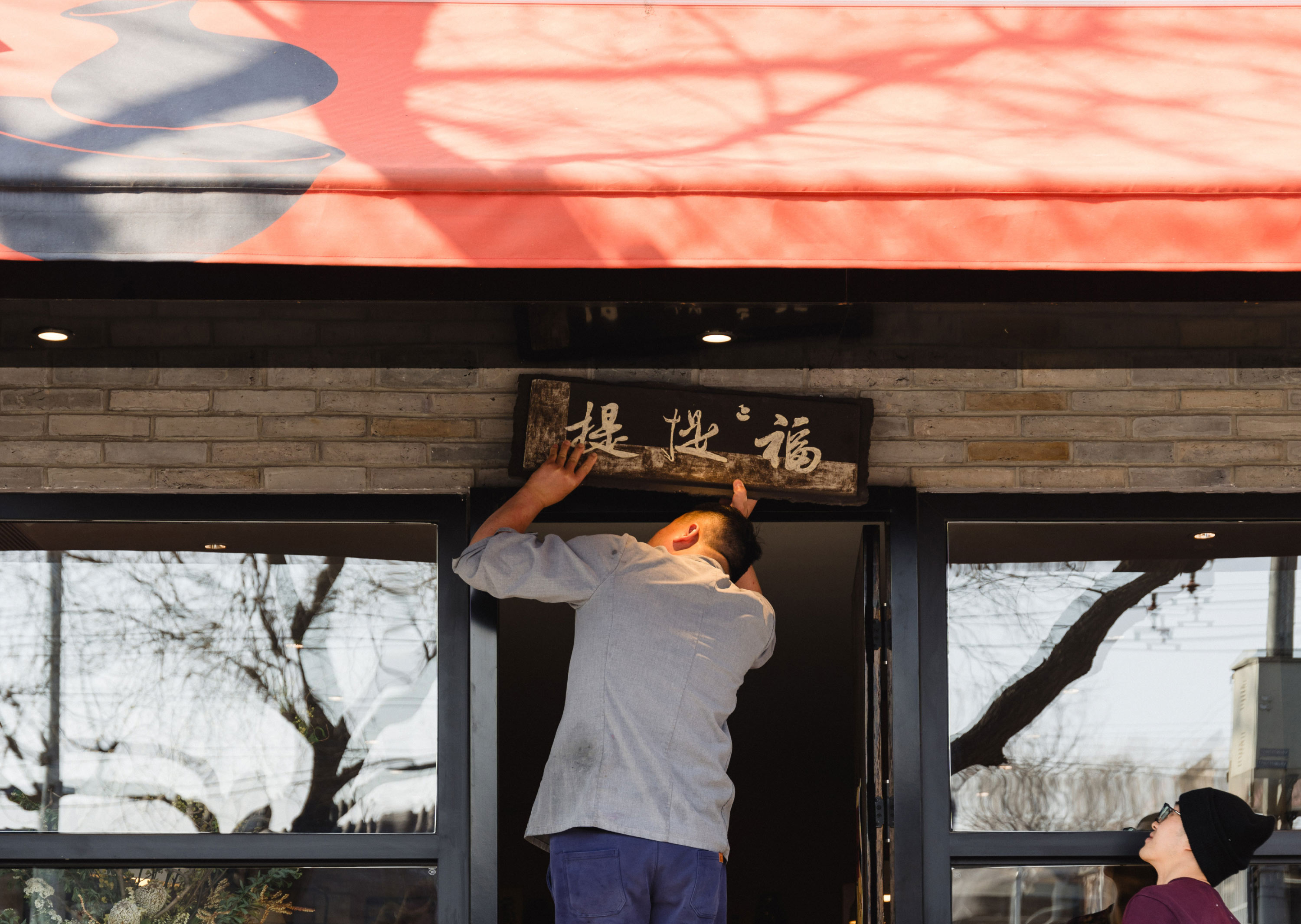
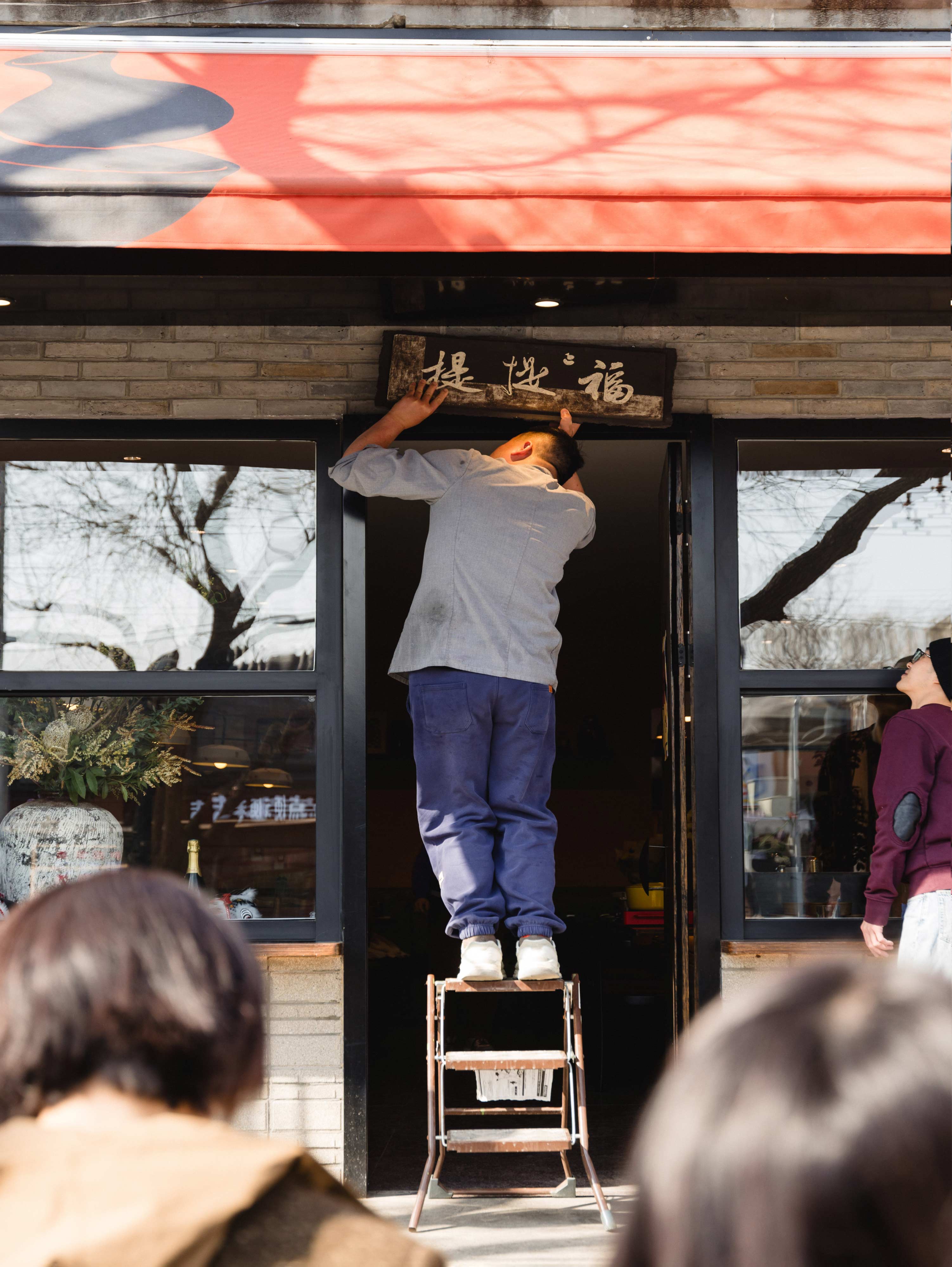
Located within Beijing’s second ring, the restaurant integrates its gray brick and black wall surroundings with a modern dining identity, blending local cultural heritage with a fresh and approachable brand image in the hutong environment.




Logo possibilities.
Making tableware.
Making signboard.
Products and event.
